

5 Research Backed Homepage Design Best Practices for Arizona SMBs

Your homepage has one job: tell visitors who you are, what you can do for them, and what to click next. Get those three things right, and everything else, layout, color, motion, is secondary. The two elements to prioritize immediately are hero clarity (a headline that states your value in under five seconds) and a single, unmissable primary call to action. These aren’t opinions; they’re conclusions drawn from usability research at Nielsen Norman Group, W3C accessibility standards, and WebAIM’s ongoing audits of real-world websites.
TL;DR:
- The hero section should clearly communicate your value, differentiate with one supporting line, and include a fast-loading visual with a CTA that emphasizes action and benefit.
- Most homepages benefit from content bands such as value, social proof, product offerings, and narrative, with smooth transitions encouraging scrolling.
- To optimize conversions, limit primary navigation to five items, prominently feature search if needed, and route visitors to their tasks with few decisions.
- Accessibility issues like contrast errors and missing semantic markup are common, and improving site speed is crucial for both SEO and user experience.
- For small businesses, a short homepage focused on familiar services is best, while more complex offerings may require longer, storytelling formats.
Table of Contents
- Homepage Design Best Practices: Five Principles That Hold Up Under Testing
- Building a Hero Section That Actually Converts
- Visual Hierarchy: Guiding the Eye Without Saying a Word
- Navigation and Routing: Fewer Choices, Faster Decisions
- Writing Copy and Placing Trust Signals People Actually Notice
- Accessibility and Performance: The Non-Negotiable Technical Layer
- Testing Your Homepage Before You Trust It
- Resources for Putting This Into Practice
- Why Branding Consistency Makes or Breaks a Homepage
- Personalization Techniques Worth the Setup Effort
- SEO Fundamentals Your Homepage Can’t Skip
- When Short Beats Long: A Homepage Length Decision Framework
- How Webtechs Turns These Principles Into a Working Homepage
- Sources
- FAQ
Homepage Design Best Practices: Five Principles That Hold Up Under Testing
Nielsen Norman Group studied homepages across industries and landed on five fundamental principles that separate homepages people actually use from ones they abandon. Treat this as your working checklist, not a suggestion list.
- Make the homepage easy to find and return to. Your logo should link back to the homepage from every page, and “Home” should exist somewhere in your navigation, even if it feels redundant.
- State who you are and what visitors can do, immediately. A visitor should understand your business and their next step without scrolling.
- Show real examples instead of vague category links. A landscaping company should show a finished backyard, not a link labeled “Services.”
- Prioritize one clear call to action. Every additional CTA competing for attention dilutes the one that actually matters.
- Keep it simple and keep motion under control. Clutter and unnecessary animation slow comprehension and cost you visitors in the first few seconds.
These principles matter more for small businesses than large ones. A national brand can survive a confusing homepage because visitors already know the name. An Arizona HVAC company or boutique law firm doesn’t have that luxury. Every visitor is evaluating you cold, and homepage layout best practices exist precisely to close that gap fast.
Building a Hero Section That Actually Converts
The hero is your elevator pitch, and it needs exactly four things: a headline, one supporting line, a primary CTA, and a visual that reinforces the message rather than distracting from it. Composite’s research on effective homepages backs a single, focused hero message over multi-slide carousels, which usability testing consistently shows people ignore or find disorienting.
Here’s how to build one:
- Write the headline first, alone. It should answer “what do you do and for whom” in one sentence, no jargon.
- Add one supporting line. This is where you differentiate. Not “Quality Service Since 1997,” but “Same-day appointments, licensed technicians, upfront pricing.”
- Choose the visual deliberately. A static image loads faster and tests better on mobile. Video adds emotional weight but only earns its place if it loads fast and doesn’t block the CTA. If load time suffers, the video isn’t worth it.
- Write CTA copy as action plus benefit. “Get a Free Quote” beats “Submit.” “Start Your Design” beats “Learn More.”
Run three quick tests before you ship: the five-second test (can a stranger say what you do after five seconds?), the mobile breakpoint check (does the hero still make sense on a phone screen without scrolling twice?), and an accessibility check for any motion in the hero.
Pro Tip: Screenshot your hero section, show it to someone unfamiliar with your business for five seconds, then hide it and ask what you do. If they can’t answer, your headline is doing decoration instead of communication.
For more on CTA wording specifically, this guide on crafting effective CTAs breaks down phrasing patterns that outperform generic buttons.
Visual Hierarchy: Guiding the Eye Without Saying a Word
Visual hierarchy works through four levers: scale, contrast, alignment, and whitespace. Bigger elements get noticed first. High-contrast text reads faster than low-contrast text sitting on a busy background. Consistent alignment tells a visitor’s eye where to travel next, and whitespace isn’t wasted space, it’s what keeps a page from feeling like a cluttered garage sale.
Most effective homepages break into content bands, each with a specific job:
- Value band: the hero, answering who you are and what you do.
- Social proof band: logos, testimonials, review counts.
- Product or service band: a grid showing your actual offerings, tied to the “show examples” principle above.
- Narrative band: deeper context for visitors who need more convincing before converting.
A common mistake is the “false floor,” a visual break that looks like the page has ended when it hasn’t. If your hero has a hard color transition and no visual cue that more content follows, visitors stop scrolling. Keep transitions between bands soft enough that scrolling feels natural.
On mobile, responsive layout adjustments matter even more. Thumbs operate in a limited reach zone near the bottom of the screen, so critical taps, especially your primary CTA, should sit where a thumb naturally lands, not buried at the top where fingers have to stretch.
Navigation and Routing: Fewer Choices, Faster Decisions
Your top-level navigation should contain only the tasks most visitors actually come to complete, not every service you offer. NN/g’s usability guidelines recommend building navigation around top tasks identified through real user research, not internal guesses about what matters.
- Limit primary navigation to five to seven items maximum; more than that and visitors start skimming instead of reading.
- Keep both an implicit home link (clicking the logo) and an explicit one (a “Home” label), since different visitors expect different cues.
- Surface search prominently if your site has more than a handful of pages or products; hiding it behind an icon costs conversions on content-heavy sites.
- Push legal links, account settings, and secondary actions into the footer, where visitors expect to find them without cluttering the main navigation.
The goal, borrowed from the Three Click Rule navigation playbook, is routing visitors to what they need in the fewest possible decisions. Every extra menu item is a fork in the road, and forks slow people down.
Writing Copy and Placing Trust Signals People Actually Notice
A strong headline formula follows who is a plus what plus differentiator: “Scottsdale’s Family-Owned Pool Service, Same-Week Scheduling.” That’s more useful than a generic tagline because it does three jobs in one sentence.
- Place example content, actual projects, actual products, high on the page so visitors form a mental model of your business fast.
- Show trust signals (client logos, review counts, certifications) near decision points, not buried in a footer no one scrolls to.
- Use short case snippets over long testimonials; a two-sentence result beats a paragraph of praise.
- Repeat your primary CTA two to four times down the page rather than once at the top.
That repetition isn’t redundant. Research on homepage conversion patterns found that one dominant CTA, echoed at multiple scroll points, reduces choice paralysis and consistently outperforms scattering several different action buttons across the page. For microcopy examples you can adapt directly, this set of website copywriting examples shows working headline and CTA pairs.
Accessibility and Performance: The Non-Negotiable Technical Layer
Skipping accessibility doesn’t just risk lawsuits, it actively breaks usability for a meaningful share of your visitors. WebAIM’s Million project documents accessibility failures across the vast majority of homepages tested, with contrast errors and missing semantic markup among the most common problems.
- Fix contrast first. Text and background color combinations need to meet WCAG contrast ratios; this is the single most common failure and the easiest to correct.
- Support keyboard navigation. Every interactive element, buttons, menus, forms, should be reachable and usable without a mouse.
- Control motion. Per W3C’s WCAG 2.1 guidance, avoid autoplaying moving content longer than five seconds unless you give users a pause or stop control.
- Hit your Core Web Vitals targets. Aim for Largest Contentful Paint under 2.5 seconds and Cumulative Layout Shift under 0.1; both directly affect bounce rates and search rankings.
On the performance side, serve modern image formats, prioritize loading order so above-the-fold content renders first, and use a CDN with caching to keep load times consistent regardless of where your visitor is browsing from.
Testing Your Homepage Before You Trust It
Track a small set of KPIs: primary CTA click rate, bounce rate, average engagement time, and your Core Web Vitals scores. If any of these drift the wrong direction after a change, you’ll catch it early.
- Run A/B tests on hero headlines and CTA wording first; they’re cheap to test and produce the clearest wins.
- Use first-click tests to see whether visitors instinctively tap the button you want them to tap.
- Run five-user comprehension tests, asking a handful of people what your business does after viewing the homepage for a few seconds.
- Layer in heatmaps to see where attention actually goes versus where you assumed it would go.
Prioritize fixes using a simple impact-versus-effort lens: a low-effort headline rewrite that could lift conversions beats a full visual redesign that might not move the needle at all. For deeper CTA-specific testing ideas, the landing page design guide walks through conversion-focused testing patterns that apply directly to homepage sections too.
Resources for Putting This Into Practice
Implementing homepage design principles is easier with a working playbook rather than a checklist alone. The Three Click Rule navigation playbook covers routing decisions in more depth, while the responsive design breakdown walks through breakpoint strategy for Arizona businesses building mobile-first.
Reviewing completed work also helps calibrate expectations. Browsing an actual portfolio of finished homepage projects shows how these principles, hero clarity, content bands, trust placement, look once built rather than sketched. University-level guidance, like the University of Arizona’s web design standards, also offers a useful accessibility and brand-alignment checklist worth cross-referencing before a launch.
Why Branding Consistency Makes or Breaks a Homepage
A homepage that uses one shade of blue in the hero and a slightly different blue in the footer looks like two different companies built it. Branding consistency isn’t decorative polish, it’s a trust signal. Visitors subconsciously read visual inconsistency as a sign of a rushed or unreliable business.
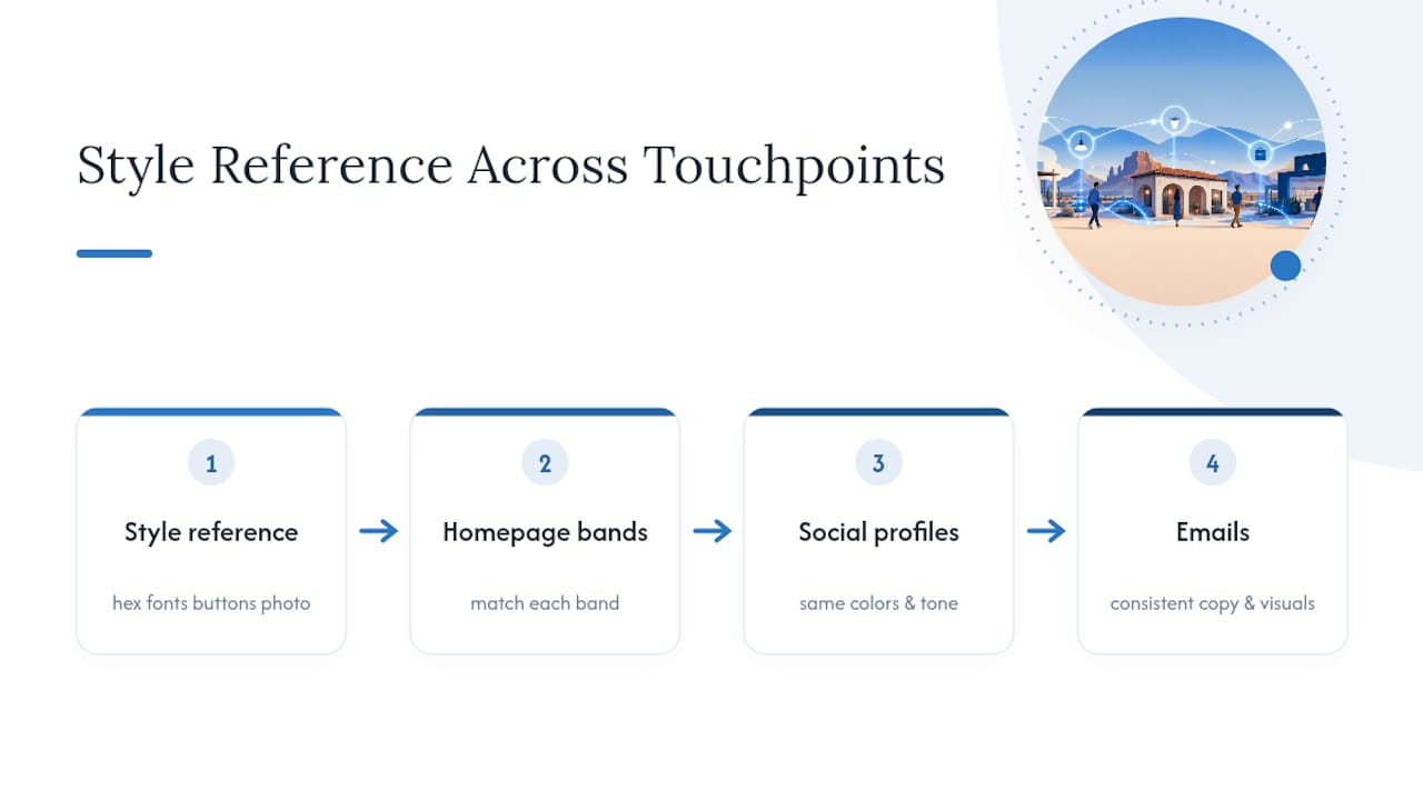
Consistency means your logo, color palette, typography, and tone of voice match across every band on the page, and match what visitors will see on your social profiles or in an email from you. If your hero copy sounds formal but your footer disclaimer sounds casual, that mismatch registers, even if visitors can’t articulate why something feels off.
The fix is straightforward but requires discipline: build a one-page style reference before designing, covering exact hex codes, font pairings, button styles, and photography tone. Every homepage band should pull from that same reference rather than each section being designed in isolation. For a small Arizona business competing against larger regional chains, consistent branding is often the fastest way to look established and credible, even on a modest budget.
Personalization Techniques Worth the Setup Effort
Personalization on a homepage doesn’t require an enterprise budget. Even simple rules, showing returning visitors a different CTA than first-time visitors, or adjusting messaging based on the city a visitor is browsing from, measurably improve engagement without a full platform rebuild.
Location-based personalization works especially well for Arizona service businesses. A homepage that detects a visitor is browsing from Scottsdale versus Phoenix versus Tucson can adjust service-area messaging automatically, which reduces the “do they even serve my area” hesitation that kills conversions before a visitor reads past the hero.
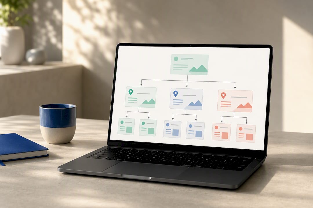
Behavioral personalization is the next tier: showing different homepage content to a visitor who’s browsed your site three times this month versus someone arriving for the first time from a Google search. First-time visitors need the full pitch, who you are, what you do, why you’re credible. Returning visitors often just need a fast path back to what they were looking at.
Start small. Even basic personalization, like swapping a generic CTA for “Welcome back, ready to schedule?”, moves the needle without requiring a full personalization engine.
SEO Fundamentals Your Homepage Can’t Skip
Your homepage carries more SEO weight than almost any other page on your site, and most small business homepages waste that weight. Start with the title tag and meta description: both should state clearly what you do and where you do it, since local search relies heavily on that combination.
Header tags matter structurally, not just visually. Your H1 should contain your core value statement, and it should exist only once per page. Image alt text should describe what’s actually in the image, both for accessibility and because search engines can’t see pictures, they read your descriptions.
Page speed doubles as an SEO factor and a usability factor, which is exactly why the Core Web Vitals targets covered earlier apply here too. A slow homepage doesn’t just frustrate visitors, it actively suppresses your search rankings. Internal linking from your homepage to key service pages also signals to search engines which pages matter most on your site, so link deliberately to your highest-value pages rather than scattering links evenly across every page you have.
When Short Beats Long: A Homepage Length Decision Framework
The right homepage length depends on how much explaining your audience needs before they trust you. If visitors already know what they want (a plumber searching “emergency plumber Scottsdale”), a short, hero-led homepage wins because they’re ready to act, not read. If you’re selling something unfamiliar, a new service category, a complex B2B product, a longer, storytelling homepage that walks through objections earns its length.
Check three things: how familiar your audience already is with your offering, how many distinct buyer personas you’re serving, and how deep their objections run before they’ll convert. For most Arizona small businesses selling a locally understood service, keep it short. Save the long-form storytelling for genuinely novel offerings.
How Webtechs Turns These Principles Into a Working Homepage
Some agencies specialize in building custom homepages that apply the exact principles covered above: clear hero messaging, one primary CTA, accessible markup, and fast load times, without the guesswork of a DIY builder or the overhead of a national firm.
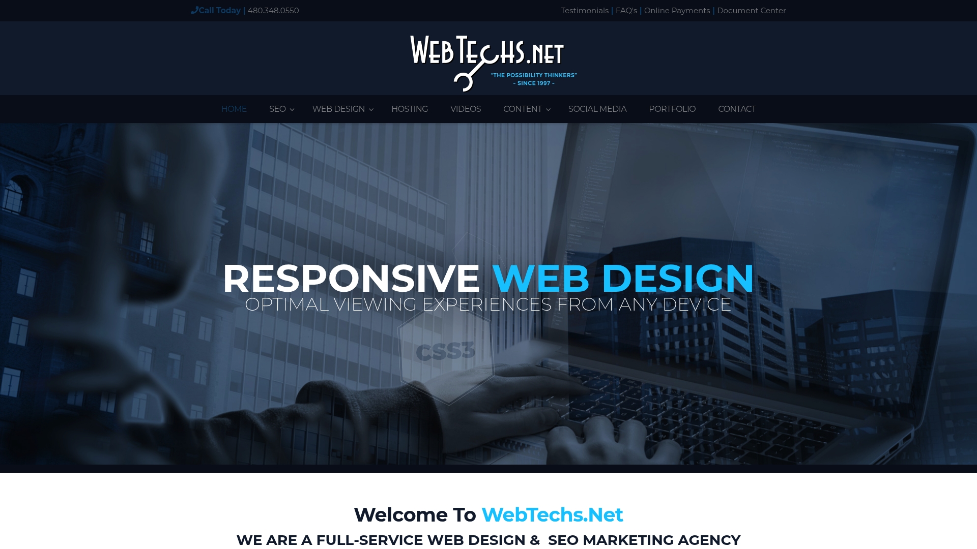
The team handles custom website design built around your specific hero messaging and content bands, along with hosting, SEO, and content writing so your new homepage doesn’t launch into silence. If you’re evaluating a redesign, start by reviewing the website design price list or browsing the completed portfolio for examples of finished homepage work. From there, request a homepage audit and get specific feedback on your hero, navigation, and load times before committing to a full rebuild.
Sources
- Homepage Design: 5 Fundamental Principles
- WebAIM Million — accessibility survey
- Website Design – University Marketing & Communications
FAQ
What Should Be on a Homepage Above the Fold?
A headline stating who you are and what you do, one supporting line, a primary CTA, and a relevant visual all need to appear before a visitor scrolls. This “elevator pitch” structure follows NN/g’s core usability guidance on preventing early abandonment.
How Many Calls to Action Should a Homepage Have?
Stick with one primary CTA, repeated two to four times down the page, plus at most two secondary CTAs for different visitor goals. Competing CTAs of equal visual weight create choice paralysis and measurably hurt conversion.
What Are the Most Common Homepage Accessibility Mistakes?
Poor color contrast and missing semantic markup top the list, according to WebAIM’s accessibility survey of homepages across the web. Autoplaying motion without pause controls is another frequent violation of W3C’s WCAG 2.1 standard.
Does Homepage Load Time Really Affect SEO?
Yes. Core Web Vitals, especially Largest Contentful Paint and Cumulative Layout Shift, factor directly into search rankings and directly affect whether visitors stay or bounce.
Can Webtechs Redesign My Homepage to Follow These Best Practices?
Webtechs builds custom homepage designs for Scottsdale-area businesses that apply hero clarity, accessibility, and performance standards from the start. Current pricing details are available on the website design price list.