

Stop Losing Calls in Scottsdale: Responsive Web Design That Converts
Yes, for most small and mid-sized Scottsdale businesses, a mobile-first responsive site is still the right default in 2026. It handles phones, tablets, and desktops from one codebase, and it remains the layout Google’s crawler expects. If your site isn’t passing that test today, the next step is a quick mobile audit or a discovery call with a local agency like Webtechs.
TL;DR:
- Responsive web design remains essential for local SEO and user experience, as it ensures your site passes Google’s mobile crawler and avoids ranking penalties.
- Building or auditing a responsive site should focus on mobile-first design, content-based breakpoints, optimized images, and thorough device testing to improve performance and usability.
- Most small and mid-sized businesses benefit from responsive layouts over adaptive ones due to lower maintenance costs and cleaner URL structures, with exceptions for specific performance needs.
- Budget for a responsive website varies by scope, with small brochure sites costing less and ecommerce features increasing expenses; planning should include ongoing maintenance and SEO.
- Hiring a local, experienced agency like Webtechs guarantees better communication, full-service support, and a portfolio of proven projects tailored to Scottsdale SMBs.
Table of Contents
- What Is Responsive Web Design, Really?
- Why Responsive Design Matters for Your Bottom Line
- How to Build or Audit a Responsive Site: A Step-by-Step Checklist
- Responsive vs Adaptive Design: Which One Does Your Business Actually Need?
- What Should a Responsive Website Cost You?
- Why Local Experience Matters When You Hire for This
- Progressive Enhancement vs. Graceful Degradation: Which Approach Fits Your Site?
- When Should You DIY and When Should You Call In Help?
- Ready to Fix Your Mobile Experience?
- Sources
- FAQ
What Is Responsive Web Design, Really?
Responsive web design means a website automatically adjusts its layout, images, and text to fit whatever screen it’s loaded on, whether that’s an iPhone at a coffee shop on Camelback Road or a 27 inch monitor in an office off Scottsdale Road. No separate mobile site, no separate app. One set of code that reshapes itself.
Three technical pieces make that happen, and understanding them helps you evaluate a developer’s proposal instead of just trusting their sales pitch.
- Fluid grids. Modern layout tools like CSS Grid and Flexbox let sections resize and reflow based on available space rather than fixed pixel widths.
- Flexible images. Techniques such as
srcsetand the<picture>element serve a smaller image file to a phone and a larger one to a desktop, so mobile visitors aren’t downloading a desktop-sized photo they’ll never fully see. - Media queries and the viewport meta tag. CSS media queries trigger layout changes at specific screen widths, and the viewport meta tag tells the browser to render the page at the device’s actual width instead of zooming out to a fake “desktop view.” MDN’s guide to responsive design walks through all three in detail.
Newer CSS features like container queries and subgrid are starting to show up in current builds too, letting individual components respond to their own container size rather than just the browser window. If a developer mentions these, it’s a decent signal they’re working with current tools rather than a five-year-old template.
Why Responsive Design Matters for Your Bottom Line
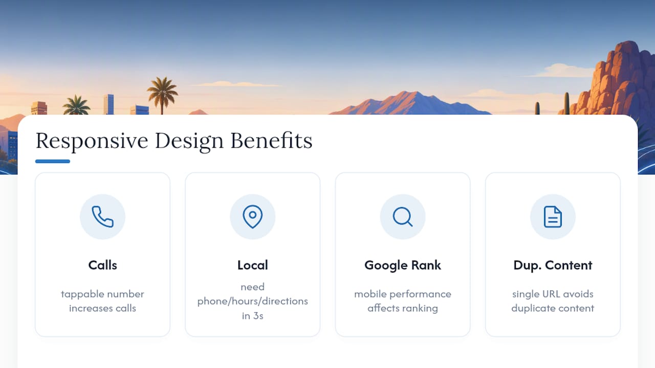
A responsive layout is a conversion tool disguised as a technical spec. When a visitor searching “plumber near me” on their phone lands on a site where the phone number is tappable and the contact form doesn’t require pinching and zooming, they’re far more likely to actually call. When the layout breaks and text runs off the screen, most people just leave and try the next result.
Local search behavior makes this sharper in Scottsdale specifically. Someone standing outside a restaurant on Old Town’s main strip is searching on a phone, not a laptop, and they want directions, hours, or a phone number in three seconds, not thirty.
There’s also a search visibility angle that a lot of business owners miss. Google indexes and ranks sites primarily by how they perform on mobile, which means a clunky mobile experience doesn’t just lose you the visitor in front of you. It can quietly suppress your ranking for every visitor after that. A single responsive URL also avoids the duplicate content headaches that separate “m.yoursite.com” mobile sites used to create, which is one reason those setups have mostly disappeared.
How to Build or Audit a Responsive Site: A Step-by-Step Checklist
Whether you’re briefing a developer or reviewing what you already have, work through these steps in order.
- Start mobile-first. Design the phone layout before the desktop layout. It forces you to prioritize what actually matters on the page instead of cramming a desktop design into a smaller box.
- Set content-driven breakpoints. Rather than designing for specific device widths, resize your browser and add a media query exactly where the layout visually breaks. That approach ages better than chasing device presets, since new phone sizes come out every year.
- Optimize images and loading. Use
srcsetfor responsive images, lazy load anything below the fold, and trim the amount of CSS and JavaScript the browser has to process before the page becomes usable. - Build in accessibility from the start. Tap targets should be at least 44 pixels, text needs to stay readable without zooming, and every interactive element should be reachable without a mouse.
- Test across real devices, not just a resized browser window. Testing on actual phones and tablets catches touch and performance issues that browser emulators miss entirely, including things like a button that’s technically visible but sits half a centimeter too close to another one.
- Run a Lighthouse audit before launch. Check performance, accessibility, and SEO scores, and fix anything flagged as a mobile usability error.
- Confirm the SEO basics are in place. Verify the viewport meta tag is correctly set, confirm there’s one canonical URL per page, and make sure content is actually crawlable, not hidden behind JavaScript that search engines can’t render.
Pro Tip: When you brief a developer or agency, ask for specific performance targets in the contract, not just a finished design. A load time under three seconds on mobile and a Lighthouse performance score above 80 are reasonable numbers to hold a vendor to.
Responsive vs Adaptive Design: Which One Does Your Business Actually Need?
Responsive design uses fluid, flexible layouts that reshape continuously across screen sizes. Adaptive design uses a handful of fixed layouts, one for phone, one for tablet, one for desktop, that swap in based on detected screen width. CSS-Tricks breaks down the mechanics of both if you want the deeper technical version.
For most Scottsdale SMBs, responsive wins on practicality alone:
- One codebase to maintain instead of several fixed templates.
- Naturally SEO-friendly with a single URL structure.
- Lower long-term maintenance costs since there’s nothing extra to keep in sync.
Adaptive or hybrid approaches earn their place in narrower situations: a performance-critical checkout flow that needs pixel-level control on specific devices, or a legacy site being modernized in stages where a full rebuild isn’t in the budget yet. UXPin’s 2026 comparison lands on responsive as the sensible default for most projects while acknowledging those exceptions. Unless you have a specific performance bottleneck a developer has already diagnosed, responsive is the safer bet.
What Should a Responsive Website Cost You?
Pricing depends heavily on scope, but a few patterns hold across most projects. A simple brochure site with five to ten pages typically costs less than a lead-generation site with forms, booking tools, and CRM integration. Small ecommerce builds run higher still, since product catalogs and payment processing add real development time. Webtechs’ website design pricing page breaks down ranges by project type.
Timelines usually run in phases: discovery and planning, design mockups, development, quality assurance, and launch. A straightforward brochure site might move through all five phases in four to six weeks. A lead-gen site with custom features often takes longer.
Budget beyond launch too:
- Hosting and security maintenance
- Ongoing content updates
- SEO work to keep rankings from sliding
Why Local Experience Matters When You Hire for This
An agency experienced since 1997 has built through several complete redesign cycles of the web, not just the current one. That kind of tenure matters in a field where “best practice” from five years ago is sometimes actively bad practice today.
Relevant services for a responsive project include:
- Custom website design built around mobile-first layouts
- Complete website hosting, so performance and security aren’t an afterthought
- Local SEO work that pairs naturally with a new responsive build
The agency’s portfolio shows completed projects for local businesses, which is worth reviewing before you commit to any vendor. This piece is written from Webtechs’ side of that work.
Progressive Enhancement vs. Graceful Degradation: Which Approach Fits Your Site?
Progressive enhancement starts with a basic, functional experience that works everywhere, then layers on richer features for browsers and devices that support them. Graceful degradation starts at the opposite end: build the full-featured experience first, then add fallbacks so older or less capable browsers don’t break entirely.
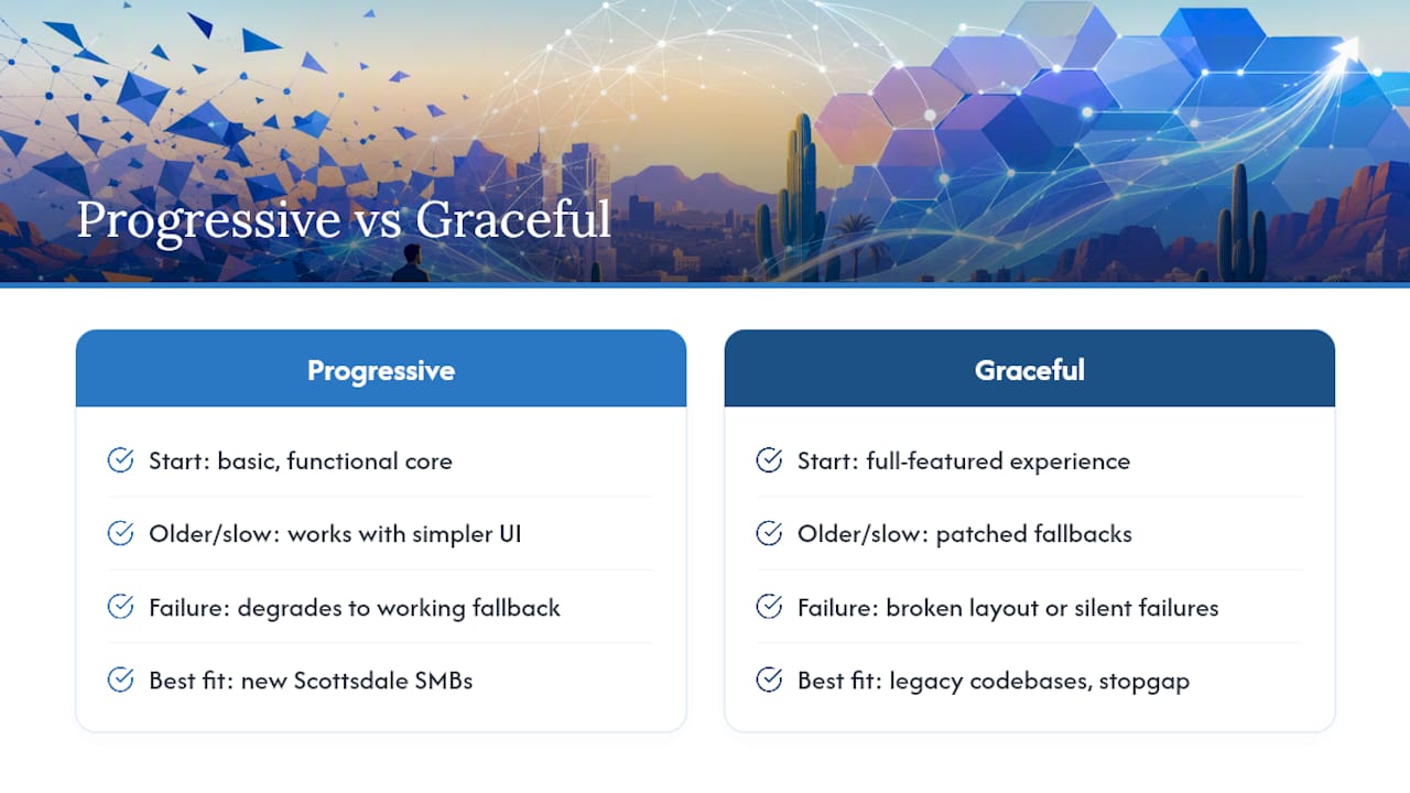
The practical difference shows up the moment something fails. With progressive enhancement, a slow connection or an older phone still gets a working site, just a simpler one, maybe without a fancy image carousel. With graceful degradation, that same visitor might see a broken layout or a feature that silently fails, because the fallback was patched on after the fact instead of planned from the start.
For most Scottsdale SMB sites, progressive enhancement is the more reliable strategy. It matches naturally with a mobile-first approach: you build the core experience for a phone on a mediocre connection first, then add enhancements for larger screens and faster connections. That order tends to produce faster, more resilient sites than starting big and hoping the fallbacks hold up.
Graceful degradation still has a place, particularly for sites carrying legacy code that can’t be fully rebuilt at once. In that case, layering in fallbacks for specific known problem areas is a reasonable stopgap while a larger modernization happens in stages. It’s a patch, not a foundation, and most businesses starting fresh in 2026 don’t need one.
When Should You DIY and When Should You Call In Help?
Simple one-page sites or basic booking pages with a modern builder are reasonable DIY territory. Once you’re dealing with ecommerce, custom booking logic, multiple content editors, or a real performance target tied to revenue, hire an agency. When vetting proposals, ask for a live example on a phone, not just screenshots, and check for how they price the work before you sign anything.
Ready to Fix Your Mobile Experience?
Webtechs is the alternative to guessing your way through a DIY builder or gambling on a freelancer who disappears after launch. As a Scottsdale agency built specifically for small and mid-sized businesses, an agency handling custom website design, hosting, and local SEO under one roof can help ensure a responsive rebuild doesn’t turn into three separate vendor relationships that don’t communicate.

Reach out and you can expect a straightforward process: a look at your current site’s mobile performance, examples from the portfolio relevant to your industry, and a clear quote before any work starts. There’s no pressure sales, just a direct answer about what a responsive rebuild would take for your specific site.
If your current site is hard to use on a phone, that’s costing you calls and bookings right now. Visit the website design page to request a quote and get a specific answer for your business instead of a generic estimate.
Sources
- Web
- Responsive vs Adaptive design – UXPin (2026)
- The difference between responsive and adaptive design | CSS-Tricks
FAQ
Is Responsive Web Design Still a Thing in 2026?
Yes. It remains the standard approach for most business websites because it uses one flexible codebase across phones, tablets, and desktops instead of separate builds. Google’s mobile-focused indexing also continues to favor sites that work well on phones, which reinforces responsive design as the default choice.
Is Web Design Still in Demand in 2026?
Web design demand has held steady, driven by businesses replacing outdated sites, adding ecommerce, and fixing mobile usability problems that hurt conversions. As long as customers keep searching for local businesses on their phones, there’s ongoing need for sites that actually work on those phones.
How Much Does It Cost to Have a Website Designed?
Cost depends on scope: a basic brochure site costs less than a lead-generation site with forms and integrations, and small ecommerce builds run higher due to catalog and payment setup. Webtechs’ pricing page lists specific ranges by project type rather than a single flat number.
What Are the Best Companies to Work for in Scottsdale?
For website design specifically, look for a local agency with a long operating history and a visible portfolio of Scottsdale clients, since that combination shows both staying power and relevant local experience. Webtechs has served small and mid-sized businesses in the area since 1997 and maintains a portfolio of completed local projects worth reviewing directly.