

Hit 5%+ Conversions: Contact Form Optimization for Scottsdale SMBs

Cut optional fields, switch to a mobile-first single-column layout, add inline validation, and swap CAPTCHA for server-side spam filtering. Those four changes move the needle more than any redesign. A typical form converts 1 to 3 percent of visitors into submissions; hitting 5 percent or better means the form is doing real work. Start by measuring your current view-to-submit rate before changing anything.
TL;DR:
- Keeping contact forms short with only essential fields can significantly increase view-to-submit rates for small businesses.
- Avoid using visible CAPTCHAs; instead, rely on backend strategies like honeypots, time traps, and rate limiting to prevent spam effectively.
- Implementing mobile-first, single-column layouts and ensuring fast load times are crucial for capturing local mobile searches.
- Connecting forms to CRMs and personalizing based on visitor context can improve follow-up speed and lead quality.
- Regular testing and incremental improvements over weeks yield more reliable results than quick, one-time A/B tests on low-volume forms.
Table of Contents
- Why Contact Form Optimization Matters for Your Bottom Line
- How Many Fields Should a Contact Form Actually Have?
- What’s the Best Way to Stop Form Spam Without a CAPTCHA?
- Does Button Copy Really Affect Form Conversions?
- What Happens After Someone Submits Your Form?
- Are Your Contact Forms Accessible to Everyone?
- How Do You Connect Your Contact Form to Sales and Marketing Tools?
- Can Personalization Actually Improve Contact Form Results?
- Is Your Contact Form Slowing Down Your Whole Page?
- What Scottsdale Business Owners Get Wrong About Form Testing
- How Webtechs Implements Contact Form Fixes for Scottsdale Businesses
- Sources
- FAQ
Why Contact Form Optimization Matters for Your Bottom Line
View-to-submit rate is the percentage of people who see your form and actually finish it. Most Scottsdale small-business sites land somewhere in that 1 to 3 percent typical range, and anything above 5 percent counts as strong performance. If your rate sits below 1 percent, something specific is broken, not just “the market.”
The usual culprits repeat across almost every underperforming form:
- Too many fields, especially ones that feel invasive before trust is established
- A validation error that clears the whole form and forces a restart
- Slow page load that kills momentum before the visitor even sees the fields
- A visible CAPTCHA that adds friction without stopping the bots that matter
Mobile matters more than most owners assume. A large share of local searches happen on a phone, and mobile-first layouts with single-column fields and properly sized tap targets consistently outperform desktop-first designs squeezed onto a small screen. If your form still uses a two-column layout on mobile, that alone could be costing you leads.
How Many Fields Should a Contact Form Actually Have?
As few as you can get away with. Cutting a form down to its essential fields is often the single highest-leverage change you can make, because every additional field is another chance for someone to quit.
Name, email, and a message box cover most lead-capture needs. Phone number helps if you plan to call back fast, but make it optional unless a phone call is genuinely how you close business. Company name, budget range, and “how did you hear about us” belong on a follow-up call, not the first form a stranger fills out.
Here’s the trick most Scottsdale business sites get wrong: they mark almost everything as required “just in case.” Every required field that isn’t truly necessary for you to respond is a reason for someone to bail. Mailchimp’s design guidance recommends labeling fields clearly as optional or required so visitors know exactly what they’re committing to before they start typing.
If you genuinely need more information, don’t front-load it. Progressive disclosure, where a question like “what service are you interested in?” reveals a couple of relevant follow-up fields, lets you keep the initial form short while still qualifying serious leads. A landscaping company and an HVAC repair service don’t need identical fields, but they also don’t need every field on the first screen.
Pro Tip: Audit your form and ask, for every single field, “Could I respond helpfully without this?” If yes, cut it or make it optional.
What’s the Best Way to Stop Form Spam Without a CAPTCHA?
Skip the visible CAPTCHA unless you’re getting hit with targeted, high-volume abuse. Most spam can be filtered quietly on the back end, and low-friction techniques like honeypots, time traps, and rate limiting stop the vast majority of bot submissions without making a real visitor prove they’re human.
A honeypot field is invisible to people but irresistible to bots that auto-fill every input on a page. Leave a hidden field named something bots love, like “website” or “url,” and reject any submission where it’s filled in. A time trap works similarly: if a form gets submitted in under two or three seconds, it’s not a person, it’s a script. Rate limiting caps how many submissions a single IP address can send in a short window, which shuts down the scripted flood attacks that hit small-business sites overnight.
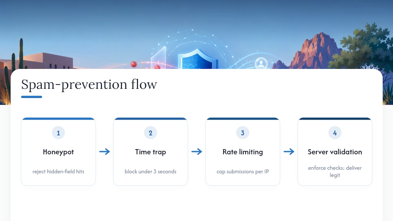
None of this replaces real validation on the server. Client-side checks make the experience smoother, but they’re cosmetic from a security standpoint. OWASP’s guidance is unambiguous: every constraint, length, pattern, format, has to be enforced again on the server, because a bot can bypass anything that only runs in the browser.
If you’re still getting flooded after honeypots and rate limiting are in place, that’s the signal to add a lightweight CAPTCHA, not before. Reaching for CAPTCHA as the first line of defense trades real conversions for a problem you probably haven’t confirmed yet. Check your actual spam volume first, then decide whether the friction is worth it.
Does Button Copy Really Affect Form Conversions?
Yes, more than most owners expect. “Submit” tells a visitor nothing about what happens next, and vague copy adds a half-second of hesitation right at the moment you need momentum. Button text that names the outcome, something like “Get My Free Quote” or “Send My Message,” reduces that last-second doubt and measurably raises completion rates.
Match the copy to what you’re actually offering. A roofing company promising a same-day estimate should say so on the button, not bury it in a paragraph above the form. A retainer-based SEO service might use “Request My Free Audit” instead of a generic “Contact Us,” because it sets a concrete expectation for what arrives in the inbox.
Trust microcopy near the submit button does quiet, unglamorous work. A single line, something like “We respond within one business day” paired with “We never share your information,” materially reduces hesitation for visitors who don’t know your business yet. That’s most of your form traffic if you’re running any paid search or social ads into Scottsdale.
Keep the microcopy short. One privacy line and one response-time promise, placed right next to the button where eyes land last, beats a wall of legal text nobody reads. If you already have a privacy policy page, link to it in three or four words rather than restating it.
Button color and size matter less than people assume once the copy and microcopy are right. A form with a generic “Submit” button in a beautiful color scheme will still underperform a plain button that says exactly what the visitor gets and when.
What Happens After Someone Submits Your Form?
The thank-you page is doing more work than most business owners give it credit for. A blank confirmation or a generic “Thanks!” message wastes the one moment you have someone’s full attention right after they’ve raised their hand.
State a specific response-time promise on the confirmation screen, not just in the pre-submit microcopy. “We’ll call you within one business day” gives the visitor a concrete reason not to also fill out three competitor forms while they wait. Vague reassurance like “we’ll be in touch soon” does the opposite, it invites them to keep shopping.
Use the thank-you page for something useful beyond confirmation. A link to your portfolio, a recent case study, or a phone number for anyone who wants to skip the wait and call directly all keep the visitor engaged instead of bouncing immediately.
Make sure the internal side of post-submit works as hard as the visitor-facing side. A submission that lands in a general inbox and sits for two days undoes every conversion gain from the form itself. Route new leads to whoever owns follow-up, and confirm the notification email actually fires, this breaks more often than owners realize, usually silently.
If your business promises a callback window, keep it. A form that says “within one business day” and then goes three days without contact damages trust faster than a form with mediocre design ever could. The promise is only as good as your team’s follow-through.
Are Your Contact Forms Accessible to Everyone?
A form that only works for someone using a mouse and a large screen is quietly turning away a chunk of visitors, and it may also expose your business to accessibility complaints under the Americans with Disabilities Act. Accessible design isn’t a separate project bolted onto a contact form. It’s the same set of fixes that improve usability for everyone.
Every field needs a visible, programmatically associated label, not just placeholder text that disappears the moment someone starts typing. Placeholder-only labels fail people using screen readers and anyone who forgets what a field was asking for once they’ve clicked into it. ARIA attributes like aria-required and aria-describedby tell assistive technology which fields are mandatory and where the error message lives when something goes wrong.
Keyboard navigation deserves a real test, not an assumption. Tab through your own form from the first field to the submit button. If focus jumps somewhere unexpected, skips a field, or gets trapped, a keyboard-only user hits the same wall. Visible focus outlines matter here too; a form that removes the default browser focus ring for aesthetic reasons makes it impossible to tell where you are.
Color contrast on error messages and required-field markers needs to meet a readable threshold, not just look “on brand.” Red text on a light pink background might pass a design review and still fail for a visitor with low vision. Test error states, not just the empty form, since that’s when contrast problems usually surface.
How Do You Connect Your Contact Form to Sales and Marketing Tools?
A contact form that dumps submissions into an inbox and nowhere else is leaving speed and follow-up quality on the table. Connecting the form to a CRM or email platform turns a one-time submission into a tracked lead with a history, instead of a message that’s easy to lose in a crowded inbox.
Most CRM platforms and email marketing tools accept form data through a webhook or a native integration, so a submission can trigger a new contact record, a tag, or an automated welcome email within seconds. That speed matters. A lead who fills out a form expecting a quick response and then waits two days for a human reply has often already contacted a competitor.
Set up notification routing so the right person sees a new lead immediately, not whoever happens to check a shared inbox that afternoon. For Scottsdale service businesses, especially field trades that don’t sit at a desk all day, this often means an SMS alert or a mobile push notification tied to the CRM entry, not just an email.
Tagging leads by which form they submitted, or which page they submitted from, gives your follow-up context before the first call. Someone who filled out a “Get My Free Quote” form on a landscaping page needs a different opening line than someone who submitted a general contact inquiry from the footer. Purpose-specific forms placed on the right pages make that segmentation almost automatic. Email service integrations can also handle the confirmation and nurture sequence without extra manual work on your end.
Can Personalization Actually Improve Contact Form Results?
Personalization on a contact form isn’t about making it feel fancy. It’s about reducing the guesswork for the visitor and the ambiguity for you. A form that adapts slightly based on where the visitor came from converts better than one identical form serving every type of inquiry.
A visitor who clicked through from a landing page about kitchen remodels shouldn’t land on a generic “Contact Us” form that asks what service they’re interested in. Pre-filling or pre-selecting that context, based on the page they were on, removes a step and signals that you already understand why they’re there.
Dynamic form fields that respond to an earlier answer keep the initial ask short while still gathering what you need. Someone who selects “residential” doesn’t need the commercial-property fields, and hiding those irrelevant fields entirely feels more like a conversation than a form.
Returning visitors deserve a lighter touch too. If someone already submitted a form once and is back on your site, a second identical form asking for the same name and email again is a small but real friction point. Remembering context, even something as simple as referencing the service they inquired about before, makes the interaction feel less like starting over.
None of this requires custom development on every page. A handful of purpose-specific forms mapped to your main service pages, paired with a CRM that carries context forward, gets most of the benefit without needing a fully dynamic form builder.
Is Your Contact Form Slowing Down Your Whole Page?
A contact form that takes three extra seconds to render can undo every other fix on this list. Visitors who came from a paid ad or a search result are already primed to leave; slow load is the easiest excuse they’ll take.
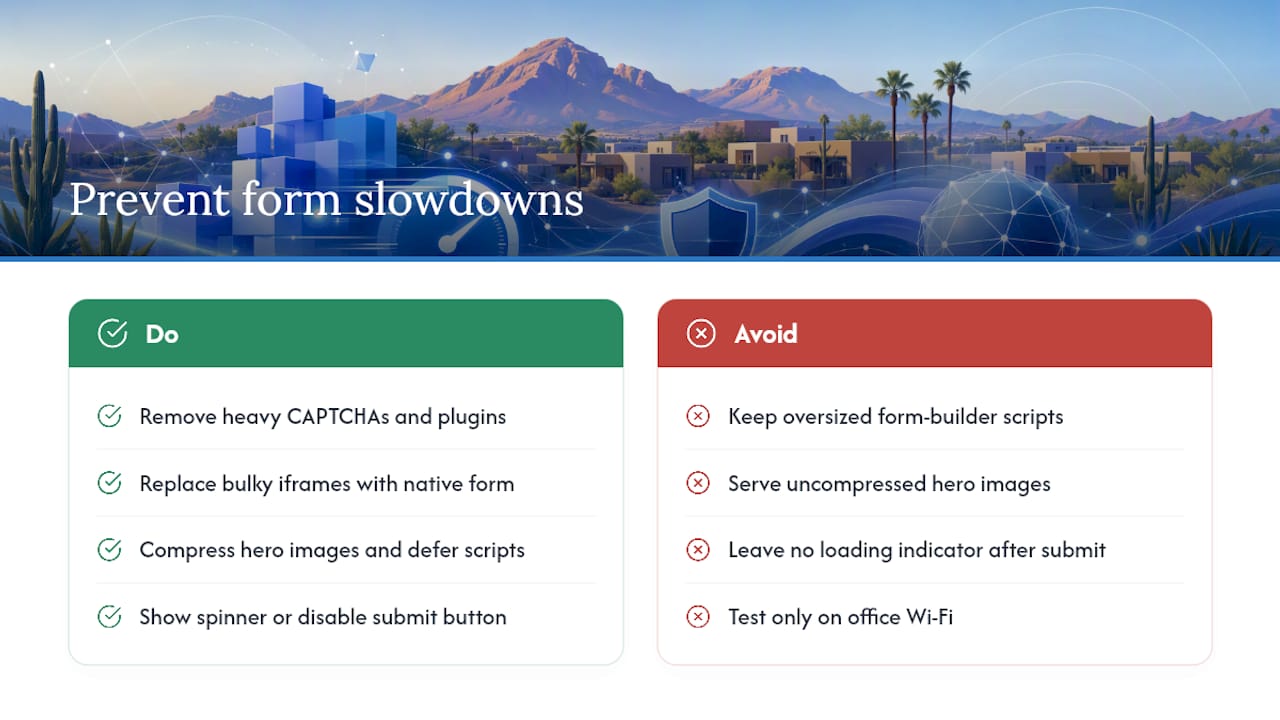
Heavy CAPTCHA scripts, oversized form-builder plugins, and third-party embeds are the usual weight problem. If your form loads through a bulky iframe from a third-party service, test whether a lighter, natively coded form performs faster; the difference is often visible in seconds, not milliseconds.
Image-heavy pages surrounding the form matter just as much as the form’s own code. A hero image that isn’t compressed can hold up everything below it, form included, especially on a mobile connection outside strong Wi-Fi coverage. Compressing images and deferring non-critical scripts until after the form renders keeps the part visitors actually need to interact with front and center.
Submission speed matters as much as load speed. A form that takes several seconds to process after someone clicks submit, with no loading indicator, invites a second click, a refresh, or an abandoned attempt. A simple spinner or disabled-button state after the first click prevents duplicate submissions and reassures the visitor that something is actually happening.
Test your form on an actual phone over cellular data, not just Wi-Fi in your office. What loads instantly on a fast office connection can crawl for someone standing at a job site with two bars of signal, which describes a lot of the local searches a Scottsdale service business is trying to capture.
What Scottsdale Business Owners Get Wrong About Form Testing
Most owners either never test their contact form again after launch, or they test everything at once and learn nothing. Both mistakes come from treating the form as a set-it-and-forget-it asset instead of a living part of the site that needs periodic attention.
The conventional advice, “just A/B test it,” undersells how noisy small-business data actually is. If your form gets a handful of submissions a week, a two-day test tells you nothing real. Change one variable, then let it run a week or two to gather a stable trend before drawing conclusions. Chasing daily numbers on a low-volume form is how owners end up flip-flopping on decisions that were never statistically meaningful in the first place.
Here’s what I’d prioritize first if I were auditing a Scottsdale small-business site tomorrow: field count and mobile layout, because those two changes affect every visitor, every time. CAPTCHA friction and CRM integration matter, but they help the leads who already made it through the form, not the ones bouncing before they start. Fix the leak before you optimize what flows through the pipe. Track view-to-submit rate weekly, and avoid making changes until you’ve established a stable baseline to compare against.
How Webtechs Implements Contact Form Fixes for Scottsdale Businesses
Some agencies offer practical alternatives to guessing your way through a form redesign. Instead of a DIY plugin update that leaves you tweaking CSS and hoping for the best, they audit your current form, rebuild it as a mobile-first single-column layout, add server-side validation to hold up against bots, and wire the results into analytics so you can track the view-to-submit rate.

Since 1997, Webtechs has built and rebuilt websites for small and mid-sized businesses across Scottsdale, and contact forms are almost always part of that work, not an afterthought bolted on at the end. A professional web design project from Webtechs includes conversion-focused form implementation as a standard part of the build, not an upsell.
If you want to see the kind of work behind that claim, browse the Webtechs portfolio for examples of sites built with the same principles covered here: short forms, fast load times, and follow-through on the back end. When you’re ready to get specific numbers for your own site, request a quote and Webtechs will walk through what a rebuilt form and full audit would look like for your business.
Sources
- OWASP Input Validation Cheat Sheet
- Contact Form Conversion Rate: Benchmarks and 12 Fixes
- Contact Form Design That Converts (2026) | Antforms Blog
- Mobile-first UX: new standards in 2026
FAQ
What Is a Good Contact Form Conversion Rate?
A typical form converts 1 to 3 percent of visitors into submissions; 5 percent or higher counts as strong performance for most small-business sites.
How Many Fields Should a Contact Form Have?
Keep it to the essentials, usually name, email, and a message field, since cutting unnecessary fields is the single highest-leverage change you can make to a form.
Is CAPTCHA Necessary to Stop Spam?
Not usually. Honeypots, time traps, and rate limiting stop most bot submissions without the friction a visible CAPTCHA adds for real visitors.
Does Webtechs Build Mobile-First Contact Forms?
Yes. Webtechs implements mobile-first, single-column contact forms with server-side validation and analytics tracking as part of its web design services for Scottsdale businesses.
How Long Should I Run a Form Test Before Judging Results?
Change one variable at a time and let it run for a week or two to gather a stable trend, especially if your form gets low weekly submission volume.