

PPC Landing Pages That Convert: A Practical Playbook

A PPC landing page is a single-purpose conversion page that mirrors the ad’s exact promise and removes every distraction standing between the visitor and one measurable action. Three things matter immediately: match your headline word-for-word to the ad, give the page one CTA, and check load speed before you spend a dollar. Get those right and your Google Ads Quality Score improves, your cost-per-click drops, and your conversion rate climbs.
- Match the headline. Copy the ad’s core offer phrase into the page’s H1.
- One CTA only. Every additional link or button cuts conversion probability.
- Speed check. Target fast mobile load times. Core Web Vitals (LCP, INP, CLS) feed directly into Quality Score.
Over half of all website traffic now comes from mobile devices, so a slow or cluttered page doesn’t just frustrate visitors — it costs you money on every click you’ve already paid for.
Key Takeaways
A PPC landing page succeeds or fails on three fundamentals: message match between the ad and the page, a single conversion goal with no distractions, and a mobile load time under 2 seconds.
| Point | Details |
|---|---|
| Message match is non-negotiable | Mirror the ad’s headline, offer terms, and CTA label on the page — any gap kills conversions. |
| One CTA per page | Every additional link or button reduces the probability of the primary conversion. |
| Mobile speed target | Aim for under 2 seconds; Core Web Vitals (LCP, INP, CLS) feed directly into Google Ads Quality Score. |
| Test one change at a time | Run headline, CTA, hero image, and form-length tests in sequence; 100 conversions per variant before calling results. |
| Webtechs for full-service builds | Webtechs handles discovery, message-match audits, design, tracking setup, and ongoing optimization for Arizona SMBs. |
Table of Contents
- What every high-converting PPC landing page needs
- How to nail message match between your ad and landing page
- Design and UX rules that increase conversions
- Speed, mobile performance, and technical musts for PPC pages
- A/B testing and an optimization roadmap for PPC pages
- How to measure success: KPIs and reporting for PPC pages
- Tools, platforms, and templates to build and test PPC pages
- Real examples and annotated templates you can copy
- Common PPC landing-page mistakes and how to fix them
- When to DIY and when to hire an agency
- What most PPC landing page advice gets wrong
- Webtechs builds and optimizes PPC landing pages for Arizona businesses
- Sources
What every high-converting PPC landing page needs
Dedicated PPC landing pages convert substantially higher than homepages because they’re built around one job. Here’s what that structure looks like in practice.
Hero headline and supporting subhead. The headline should repeat the ad’s offer language almost verbatim. If the ad says “Free Roof Inspection in Phoenix,” the H1 says “Free Roof Inspection in Phoenix.” The subhead adds one line of proof or urgency: “Licensed contractors. Same-week appointments available.”
Single, benefit-driven CTA. The button label should name the outcome, not the action. “Get My Free Quote” outperforms “Submit” every time. Keep forms to four fields or fewer — name, email, phone, and one qualifying question. Every extra field you add reduces the odds someone finishes.
Hero visual. The image above the fold should reinforce the offer, not decorate the page. A photo of the actual product, a before/after, or a short explainer video tied to the ad’s promise all work. Generic stock photography of smiling people in offices does not.

Social proof above the fold. Trust badges, star ratings, review counts, or a single strong testimonial should be visible without scrolling. This is especially important for local-service and professional-service pages, where trust is the primary conversion barrier.
Minimal navigation. Remove the global nav. Remove the footer links. The only clickable elements on the page should be the CTA and, optionally, a phone number. Every exit point you leave open is a conversion you’re giving away.
Microcopy for objections. A line under the form button — “No credit card required” or “We never share your info” — removes the last hesitation before a visitor clicks.
Pro Tip: Place your CTA button both above the fold and again after your social proof section. Visitors who scroll past your testimonials are already more convinced — give them a second chance to convert without scrolling back up.
How to nail message match between your ad and landing page
Think of the ad and the landing page as a relay race. The ad creates intent and hands the baton to the page. If the page drops it — different headline, different offer, different tone — the visitor bounces and you’ve paid for nothing.
Shopify’s guide to PPC landing page design frames this well: the ad sets an expectation, and the landing page must catch that expectation immediately. Mismatches, even subtle ones, create a split-second of doubt that kills conversions.
Here’s what to audit on every page before launch:
Headline. Does the H1 contain the ad’s primary offer phrase? Not a paraphrase — the actual words.
URL path. Does the URL slug reinforce the offer? /hvac-summer-tune-up beats /services.
Offer copy. If the ad mentions a price, discount, or deadline, the page must show the same figure. A visitor who clicked “$49 inspection” and lands on a page with no price mentioned will assume the deal expired.
CTA label. The button text should echo the ad’s call to action.
Visual tone. If the ad uses a bold, high-contrast design with red urgency elements, a soft pastel landing page creates cognitive dissonance. Keep the color palette and visual energy consistent.
Before (broken): Ad says “Get a Free Website Audit — Limited Spots.” Landing page headline reads “Digital Marketing Services for Arizona Businesses.” The visitor has no idea they’re in the right place.
After (fixed): Landing page H1 reads “Claim Your Free Website Audit — Limited Spots Available.” The offer, the urgency, and the free-value hook all carry through.
Design and UX rules that increase conversions
Visual hierarchy is the order in which a visitor’s eye moves down the page. Get it wrong and the CTA gets buried. The correct order: hero (headline + subhead + CTA), proof (testimonials or trust badges), benefits (three to five bullet points), a second CTA, and supporting details (FAQs, guarantees, fine print) at the bottom.
Do/don’t checklist for the hero area:
- Do: Use a headline that names the specific outcome the visitor gets.
- Do: Place the primary CTA button above the fold, in a contrasting color.
- Do: Use directional cues (an arrow, a person’s gaze) that point toward the CTA.
- Don’t: Use a hero image that competes with the headline for attention.
- Don’t: Put two equally prominent CTAs side by side — pick one.
- Don’t: Use autoplay video with sound. It startles visitors and increases bounce.
Mobile vs. desktop. On mobile, stack content vertically and make tap targets at least 44px tall. Condense the hero copy — a three-line headline that reads well on desktop often needs to be cut to one punchy line on a 375px screen. Move the form below the headline rather than beside it. Test on an actual phone, not just a browser resize.
Microcopy examples that remove hesitation:
- Button: “Get My Free Quote” (not “Submit”)
- Under the form: “Takes 30 seconds. No spam, ever.”
- Phone number label: “Prefer to talk? Call us now.”
- Error state: “Please enter a valid email — we’ll send your results there.”
Small copy changes like these consistently lift form completion rates because they answer the visitor’s unspoken objection at the exact moment it arises.
Speed, mobile performance, and technical musts for PPC pages
Page speed isn’t a nice-to-have for paid traffic. Google’s landing page guidance is explicit: fast mobile load times and relevant content are the two primary levers for improving landing page experience, which feeds directly into Quality Score. A lower Quality Score means higher CPCs for the same ad position.
Target: fast mobile load times to keep visitor engagement. Longer load times risk losing a significant share of paid visitors before the page even loads.
Core Web Vitals to monitor:
- LCP (Largest Contentful Paint): Measures how fast the main content loads. Target under 2.5 seconds. Fix: compress hero images to WebP format, preload the hero image in the HTML
<head>. - INP (Interaction to Next Paint): Measures responsiveness to user input. Fix: remove unused JavaScript and defer non-critical scripts.
- CLS (Cumulative Layout Shift): Measures visual stability. Fix: set explicit width and height attributes on all images and embeds so the browser reserves space before they load.
Quick wins for marketers (ask your developer for these):
- Convert all images to WebP. A 400KB JPEG becomes roughly 100KB in WebP with no visible quality loss.
- Inline critical CSS so the above-the-fold content renders without waiting for a full stylesheet download.
- Remove or defer any third-party scripts (chat widgets, social embeds) that aren’t essential to conversion.
- Use a CDN so the page loads from a server close to the visitor.
Tracking setup. Before you run a single click, confirm UTM parameters pass through to GA4, your conversion pixel fires on the thank-you page, and phone call conversions are tracked via a dynamic number insertion tool. Call tracking for ads is often the most overlooked gap in PPC measurement — if a visitor calls instead of filling out the form, that conversion disappears from your data without it.
Pro Tip: Run your landing page through Google PageSpeed Insights and Google Search Console’s Core Web Vitals report before launch. Both are free and give you specific, prioritized fixes rather than generic advice.
A/B testing and an optimization roadmap for PPC pages
The rule is simple: change one thing at a time. Testing two elements simultaneously makes it impossible to know which change drove the result. HubSpot’s guidance on PPC landing pages recommends a structured sequence, and the logic holds: start with the elements that have the highest impact on first impressions.
Recommended testing sequence:
- Headline — the single highest-leverage element. Test the ad’s exact phrase vs. a benefit-led variant.
- CTA button copy — “Get My Free Quote” vs. “Start My Free Trial” vs. “Claim Your Spot.”
- Hero image — product photo vs. lifestyle image vs. explainer video thumbnail.
- Form length — 4 fields vs. 2 fields. Shorter forms almost always increase submissions; the trade-off is lead quality.
- Social proof placement — above the fold vs. directly above the CTA.
On sample size. Don’t call a test after 50 conversions. A common threshold for reasonable confidence is 100 conversions per variant before drawing conclusions. Running a test for less than two weeks also risks day-of-week bias — a Monday-heavy sample may not represent your full audience.
| Experiment | Primary metric | Secondary metric | Risk level |
|---|---|---|---|
| Headline variant | Conversion rate | Bounce rate | Low |
| CTA button copy | Click-through rate on CTA | Form starts | Low |
| Hero image swap | Conversion rate | Time on page | Low |
| Form length (4 vs. 2 fields) | Form completions | Lead quality (CRM) | Medium |
| Social proof placement | Conversion rate | Scroll depth | Low |
| Urgency element (countdown) | Conversion rate | Bounce rate | Medium |
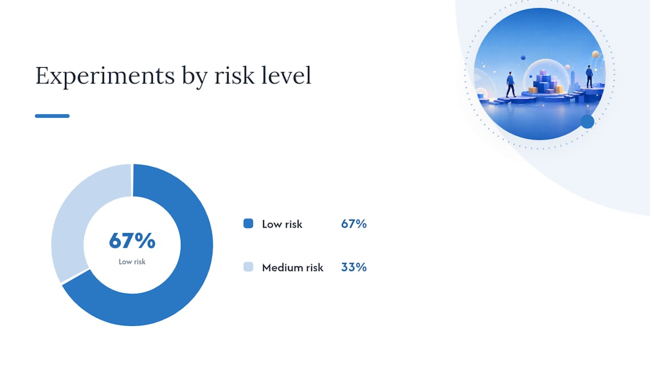
Run tests in order of risk. Low-risk experiments (copy changes) cost nothing to revert. Medium-risk changes (form structure, urgency elements) can hurt lead quality if they attract the wrong visitors, so monitor CRM data alongside raw conversion counts.
How to measure success: KPIs and reporting for PPC pages
Conversion rate is the headline number, but it doesn’t tell the whole story.
Primary KPIs:
- Conversion rate: form fills, purchases, or calls divided by total sessions. Vertical benchmarks vary significantly — financial services pages average around 8.4%, B2B SaaS runs 2.5–4%, home services sits near 3.8%, and legal around 4.2%. Know your vertical’s baseline before judging your own numbers.
- Cost per acquisition (CPA): total ad spend divided by conversions. The threshold that triggers optimization depends on your product margin.
- ROAS (Return on Ad Spend): revenue divided by ad spend. Relevant for ecommerce; less useful for lead-gen where deal close rates vary.
- Cost per lead (CPL): total spend divided by qualified leads. More useful than raw CPA for service businesses.
- Landing page bounce rate (GA4): a high bounce rate on a paid session usually signals message mismatch or a slow load, not a bad offer.
- Quality Score (Google Ads): a 1–10 score that reflects expected CTR, ad relevance, and landing page experience. A score below 5 on a core keyword is a direct signal to audit the page.
Secondary signals worth watching:
- Form abandonment rate (how many visitors start but don’t finish the form)
- Scroll depth (are visitors reaching your social proof and second CTA?)
- Session recordings and heatmaps via tools like Microsoft Clarity or Hotjar
- Micro-conversions: video plays, calculator uses, chat initiations
Example GA4 + Google Ads dashboard setup:
| Metric | Source | Threshold to act |
|---|---|---|
| Conversion rate | GA4 / Google Ads | Below vertical benchmark |
| CPA | Google Ads | Above target margin |
| Bounce rate (paid sessions) | GA4 | Over half |
| Quality Score | Google Ads | Below 6 on core keywords |
| LCP | PageSpeed Insights / CWV | Above 2.5 seconds |
| Form abandonment | GA4 funnel / Hotjar | Above 50% |
Set up conversion tracking in GA4 with distinct events for macro conversions (form submit, purchase) and micro conversions (phone click, video play). Attribution windows matter: a 30-day click window is standard for most lead-gen campaigns, but check whether your sales cycle is longer before shortening it.
Tools, platforms, and templates to build and test PPC pages
The right tool depends on how fast you need to launch and how much technical control you want.
Hosted landing page builders are the fastest path from idea to live page. They come with pre-built templates, built-in A/B testing, and integrations with major CRMs and ad platforms.
- Unbounce is purpose-built for PPC. Its Smart Traffic feature routes visitors to the variant most likely to convert based on their attributes. Strong integration with Google Ads and GA4, and a template library built around conversion best practices. User reviews on G2 consistently highlight ease of use and testing speed as its primary strengths.
- Leadpages is a solid choice for small businesses and solo marketers who need to launch quickly without a developer. Templates are clean, the drag-and-drop editor is straightforward, and it connects to most major email and CRM tools.
CMS-based pages (WordPress with a page builder like Elementor or Divi) give you more design control and keep everything on your own domain. The trade-off is slower setup and more maintenance. Good for teams with a developer on call.
Custom builds make sense at scale — when you’re running dozens of ad groups and need dynamic content insertion or deep CRM integration that off-the-shelf tools can’t handle.
Must-configure integrations before launch:
- Google Ads conversion tracking (linked to GA4 or direct pixel)
- GA4 with enhanced measurement and custom events
- Google Tag Manager for clean, auditable tag management
- CRM webhook or native integration (HubSpot, Salesforce, or equivalent)
- Call tracking (dynamic number insertion tied to UTM source)
Quick selection guide:
- Lead gen, fast launch, limited budget: Leadpages or Unbounce
- Ecommerce product pages: Shopify’s native landing page tools or a Shopify-compatible builder
- Local services with call-heavy conversions: custom or CMS-based page with call tracking configured from day one
- Keyword research and competitive benchmarking: Semrush’s advertising toolkit for identifying which landing page angles competitors are running
Real examples and annotated templates you can copy
Four templates cover the most common PPC scenarios. Each one is generic enough to adapt in under an hour.
1. Lead-gen (local service)
Headline: “Free [Service] Estimate in [City] — Book in 60 Seconds”
Subhead: “Licensed, insured, and [X] 5-star reviews on Google.”
Hero visual: Photo of the actual service being performed, or a team photo with uniforms and branded vehicle.
CTA: “Get My Free Estimate”
Form fields: Name, phone, zip code, service type (dropdown)
Trust signals: Google rating badge, BBB accreditation, years in business
For local-service pages, above-the-fold social proof is the primary trust lever. A visitor searching “emergency plumber Scottsdale” is already in buying mode — they need to know you’re legitimate before they’ll hand over a phone number. Google Business Profile optimization feeds directly into the review counts you can display here.
2. Ecommerce product page
Headline: “[Product Name]: [Primary Benefit] — Ships Free Today”
Subhead: “Over [X] customers. [Return policy in one line].”
Hero visual: Product on white background plus one lifestyle shot showing it in use.
CTA: “Add to Cart” (above fold) + “Buy Now — Free Shipping” (below reviews)
Form fields: None — streamlined add-to-cart flow
Urgency element: “Only [X] left in stock” or a countdown to same-day shipping cutoff
Shopify’s built-in landing page tools handle most of this natively. For ad-specific variants, a dedicated page (not the standard product page) lets you test headlines and offers without affecting your organic product listing.
3. Free-trial SaaS
Headline: “Start Your Free [X]-Day Trial — No Credit Card Required”
Subhead: “Join [X] teams already using [Product] to [specific outcome].”
Hero visual: Product screenshot or short screen-recording GIF showing the key feature.
CTA: “Start Free Trial”
Form fields: Email only (or email + company name)
Objection copy: “Cancel anytime. Setup takes under 5 minutes.”
The “no credit card required” line belongs in both the headline area and the button microcopy, as it removes the single biggest friction point for SaaS trials.
4. Local services with a calculator or qualifier
Headline: “See How Much You Could Save on [Service] in [City]”
Subhead: “Answer 3 quick questions. Get a personalized estimate instantly.”
Hero visual: Calculator UI mockup or a simple graphic showing the savings range.
CTA: “Calculate My Savings”
Form fields: Multi-step: 3 qualifying questions, then name and email on the final step
Dynamic content note: If you’re running ads to multiple cities in Arizona, use URL parameters to swap the city name in the headline dynamically. Unbounce’s Dynamic Text Replacement and Google Ads’ ValueTrack parameters make this straightforward.
- Use urgency (countdown timers, limited spots) only when the scarcity is real. Fake urgency erodes trust the moment a visitor returns and sees the same timer reset.
- Quizzes and calculators work well for higher-consideration purchases where the visitor needs to feel understood before converting.
- Dynamic content for segmented ads: if you’re running separate ad groups for “commercial HVAC repair” and “residential HVAC repair,” each group should point to a page where the headline and hero image reflect that specific segment.
Common PPC landing-page mistakes and how to fix them
Most underperforming pages share the same handful of problems. Here’s what to look for and what to do about it.
- Sending paid traffic to the homepage. The homepage serves too many audiences and has too many exit points. Dedicated landing pages consistently outperform homepages for paid traffic. Fix: build a dedicated page for each ad group or campaign theme.
- Message mismatch. The ad promises one thing; the page says something else. Fix: do a side-by-side audit of the ad and the page headline before launch. The offer language must match.
- Slow mobile load. A page that takes 4 seconds to load on a phone loses a large share of paid visitors before they see the offer. Fix: run PageSpeed Insights, compress images to WebP, and defer non-critical scripts.
- Too many CTAs. Three buttons pointing to three different actions split the visitor’s attention and reduce the probability of any single conversion. Fix: pick one goal per page, one CTA.
- Long forms. Asking for company size, annual revenue, and job title on a first-touch lead-gen page kills completion rates. Fix: cut to four fields or fewer. Qualify leads in the follow-up sequence, not the form.
- Missing or broken conversion tracking. If your Google Ads conversion pixel isn’t firing, you’re optimizing blind. Fix: use Google Tag Manager’s preview mode and GA4’s DebugView to confirm every event fires before you spend.
- No social proof. A page with no reviews, ratings, or trust badges asks visitors to take a leap of faith. Fix: add at least one trust signal above the fold — a star rating, a client count, or a recognizable logo.
Triage process for a low-performing page: Start with a heatmap (Microsoft Clarity is free) to see where visitors drop off. If most exits happen above the fold, the headline or load speed is the problem. If visitors scroll but don’t click, the CTA or social proof needs work. Run one A/B test on the highest-friction point before changing anything else.
When to DIY and when to hire an agency
The decision comes down to four variables: budget, testing velocity, in-house technical skills, and how fast you need results.
DIY makes sense when:
- You have one or two campaigns and can manage a builder like Unbounce or Leadpages yourself.
- Your monthly ad spend is low enough that agency fees would represent a disproportionate share of budget.
- You have someone in-house who can write copy, interpret GA4 data, and run basic A/B tests.
Hiring an agency makes sense when:
- You’re running multiple campaigns across different verticals or geographies and need consistent message match across dozens of pages.
- Your current pages have poor Quality Scores and you’re not sure why.
- You need tracking, CRM integration, and ongoing optimization but lack the technical bandwidth.
Agency evaluation checklist:
- Ask for landing page case studies with before/after conversion data, not just traffic numbers.
- Ask how they handle message match audits — do they review ad copy and page copy together?
- Ask about their A/B testing cadence. Monthly tests are the minimum; weekly is better.
- Confirm they set up conversion tracking before launch, not after.
- Ask which tools they use for session recordings and heatmaps.
- Check their reporting format — you should see CPA, conversion rate, and Quality Score in every report.
Sample timeline for an agency-led landing page project:
- Week 1: Discovery and message-match audit (ad copy, existing pages, competitor pages).
- Week 2: Wireframe and copy draft, client review.
- Week 3: Design and development, tracking setup (GA4, Google Ads pixel, call tracking).
- Week 4: QA, launch, and baseline data collection.
- Weeks 5–8: First A/B test cycle; optimization based on heatmap and conversion data.
Webtechs handles this full scope for small and mid-sized businesses in Arizona, from the initial message-match audit through design, development, tracking, and ongoing optimization. If you’re evaluating whether agency help is worth the cost, PPC management pricing breaks down what a typical engagement looks like for SMBs.
What most PPC landing page advice gets wrong
The standard advice — match your headline, use one CTA, make it fast — is correct. But it’s also incomplete in a way that costs marketers real money.
The part most guides skip is the funnel alignment problem. A landing page that converts well for a bottom-of-funnel “buy now” keyword will perform poorly for a mid-funnel “how does X work” keyword, even if the page is technically perfect. The offer has to match not just the ad’s words but the visitor’s stage of intent. Sending someone who searched “what is PPC” to a “Get a Free PPC Audit” page is a message match failure even if the headline says “PPC.” The intent is informational; the page is transactional.
The second thing most guides underweight is Quality Score’s compounding effect. Over a $5,000/month budget, that’s a meaningful difference. Yet most marketers treat Quality Score as a vanity metric and optimize for conversion rate alone. The two are connected — a page that converts well is usually also relevant and fast, which lifts Quality Score — but it’s worth tracking both explicitly.
Third: form length advice is almost always oversimplified. “Fewer fields = more conversions” is true for raw submission volume. It’s not always true for qualified leads. A two-field form (name + email) might double your lead count while halving the close rate if it attracts tire-kickers who never intended to buy. The right form length depends on your sales process, not a universal rule. Test it — but track lead quality in your CRM, not just form completions in GA4.
The practical takeaway: treat your landing page as a system with three connected levers — relevance (message match + intent alignment), trust (social proof + speed), and friction (form length + CTA clarity). Pull all three before declaring a page optimized.
Webtechs builds and optimizes PPC landing pages for Arizona businesses
Running paid ads without a purpose-built landing page is the most common way small businesses waste their Google Ads budget. Webtechs has been building conversion-focused pages for Arizona SMBs since 1997, handling everything from the initial message-match audit to design, development, tracking setup, and ongoing A/B testing.
The difference between a generic web page and a page built specifically for a paid campaign is measurable in Quality Score, CPA, and conversion rate. Webtechs’s process starts with your ad copy and works backward to the page, so the two are aligned from day one. No guesswork on what to test first, no missing conversion pixels, and no pages that look great but don’t convert.
Browse the Webtechs portfolio to see past work, or visit the professional web design page to get a quote for a landing page built around your specific campaign goals.
Sources
- Optimize your ads and landing pages – Google Ads Help
- Google Ads Landing Page: Examples, Benchmarks, and a Diagnostic Tool (2026)
- PPC Landing Page Design: Tips and Best Practices (2026) – Shopify