

Three Click Rule: Website Navigation Design Playbook for Designers

Good website navigation design answers two questions instantly: “Where am I?” and “Where can I go?” If a visitor has to think about either one, the menu has already failed. The fastest fix for most sites isn’t a redesign. It’s auditing the information architecture and making sure the paths to your primary conversions are visible, not buried three clicks deep.
TL;DR:
- Primary navigation should be limited to four to six clear categories, with a shallow hierarchy to prevent user disorientation.
- Navigation patterns must suit screen size and content type, with mobile users favoring bottom tabs and desktop users benefiting from top bars or mega menus.
- Testing navigation with real users through card sorting, tree testing, and accessibility checks helps identify and fix structural issues early.
- Accessibility features like focus states, skip links, and click-activated submenus are essential to meet WCAG 2.1 standards and ensure everyone can navigate effectively.
- Structuring information architecture correctly before designing menus leads to better usability and conversion, avoiding the temptation to fix issues with visual polish alone.
Table of Contents
- Core Principles Every Navigation Menu Should Follow
- Choosing Navigation Patterns for Desktop, Mobile, and Large Sites
- Turning Information Architecture Into a Navigation Users Can Actually Find
- Accessibility Requirements Every Navigation Bar Needs
- How to Test Navigation Decisions Before and After Launch
- Navigation Patterns Worth Stealing
- The Gap Between Trendy Navigation and Navigation That Works
- Get Your Navigation Structure Right the First Time
- Standards and Research Behind This Guide
- Sources
- FAQ
Core Principles Every Navigation Menu Should Follow
Navigation is not a design layer you add after the site is built. It’s a direct reflection of your information architecture, and if the IA is a mess, no amount of clever menu styling will fix it. Get the structure right first, then design the interface for it.
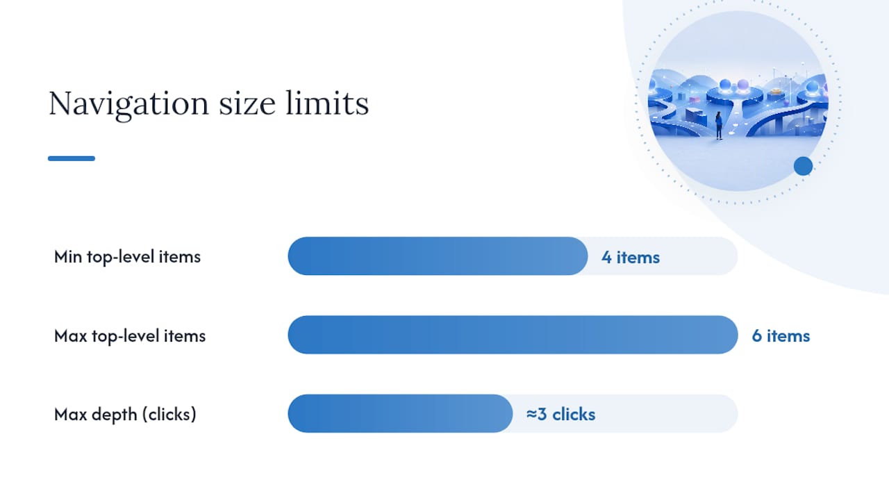
A few numbers guide that structure. Aim for a small number of primary categories in your top-level menu, and keep the hierarchy fairly shallow to maintain user orientation. Beyond that, users lose track of where they are, and WCAG 2.1’s location guidance exists precisely because deep, disorienting structures are a documented accessibility failure.
Group items the way users think, not the way your org chart is arranged. A visitor searching for “return policy” doesn’t care if it lives under “Customer Service” internally. It needs to live where they’d look for it.
- Base categories on user tasks and search behavior, not internal department names
- Cap top-level items at 4 to 6; if you need more, you likely have an IA problem, not a navigation problem
- Limit depth to about three clicks from homepage to any page
- Build in a search bar and hub pages as secondary discovery paths, especially for large catalogs
Pro Tip: Before you touch a wireframe, write your top-level labels on index cards and sort them the way a first-time visitor would. If you can’t group them cleanly into 4 to 6 buckets, your IA needs work before your nav does.
Choosing Navigation Patterns for Desktop, Mobile, and Large Sites
The right pattern depends on screen size, content volume, and how often users need to jump across sections. Here’s how to choose:
- Top navigation bar. Works well for most desktop sites with a moderate number of primary sections. Keep it persistent so users always know where they can go.
- Mega menu. Use this for large catalogs or content-heavy sites where a single dropdown needs to expose subcategories at a glance, e-commerce is the classic case.
- Sidebar navigation. Fits app-like interfaces and dashboards where users move between related tools or sections repeatedly, not one-off page visits.
- Bottom tab bar (mobile). Reserve this for your core most-used destinations, since it sits in the thumb zone and stays visible without extra taps.
- Hamburger menu (mobile). Use only for overflow items, not primary navigation. Nielsen Norman Group’s research shows hidden menus consistently hurt discoverability and task completion compared to visible options.
Hybrid patterns work well at scale. Sites like Amazon combine a persistent top bar with a mega menu and a search-first mobile layout, because no single pattern handles both breadth and depth alone. Whatever you choose, respect touch target sizing on mobile (44px minimum is the common baseline) and never hide a primary conversion path behind a hamburger just to save vertical space.
Turning Information Architecture Into a Navigation Users Can Actually Find
Good IA on paper doesn’t guarantee a usable menu. You have to test it with real people before you ship it. The sequence that works:
- Card sort first. Let users group your content their way, before you impose a structure.
- Tree test second. Give them a task (“find the return policy”) and watch where they click in a stripped-down version of your proposed IA.
- Review analytics third. Page views and existing search-query data tell you which links deserve top billing and which ones can move down a level.
- Label test last. Run quick, task-based checks: show a label alone and ask what a user expects to find behind it.
Navigation problems are almost always IA problems wearing a different hat, which is why card sorting and tree testing early saves you from bolting on navigation “fixes” later that never really solve the root issue.
Prioritize top-level links by combining page-view data with stated user goals, not just internal priorities. And when a section has too much to fit in a flat menu, build a hub page instead of stacking another submenu level. Hub pages and progressive disclosure keep large sites navigable without forcing users through four nested dropdowns.
Pro Tip: If a label needs a tooltip to explain what it means, it’s the wrong label. Rewrite it in the words your users actually typed into your site search.
Accessibility Requirements Every Navigation Bar Needs
Accessible navigation isn’t a bolt-on feature, it’s a baseline requirement, and WCAG 2.1’s Success Criterion 2.4.8 specifically calls out location awareness as a compliance requirement. Human Standards frames the same idea more simply: users need to know where they are and what’s available, every screen, every time.
A simple pre-launch QA checklist catches most of what goes wrong:
- Use semantic HTML:
<nav>,<header>,<main>, with uniquearia-labelvalues when multiple nav regions exist on one page - Add a skip link so keyboard users can bypass repeated navigation blocks
- Keep focus states visible; never strip default outlines without replacing them
- Make submenus click-activated, not hover-only. Hover-dependent menus fail on touchscreens and for anyone using a keyboard
- Build with progressive enhancement so core links still work if JavaScript fails to load
One checklist covering keyboard flow, screen reader behavior, skip links, and visible focus states catches roughly 80% of navigation accessibility issues before a site ever reaches launch. That’s a strong return for a QA pass that takes an afternoon.
Pro Tip: For single-page apps, prefer click-activated menus with explicit focus management over retrofitted ARIA roles. Complex ARIA patched onto existing markup is one of the most common sources of fragile accessibility bugs.
How to Test Navigation Decisions Before and After Launch
Testing navigation isn’t optional if you want data instead of guesses. Run both qualitative and quantitative checks before calling any menu final.
- Tree testing to confirm users can find target content in your proposed structure without visual design distracting them.
- First-click testing to see whether the very first click a user makes is the right one, since a wrong first click predicts task failure most of the time.
- Moderated usability sessions for anything high-stakes, like checkout flows or account settings.
- A/B tests on label wording, run directly on high-traffic landing pages, which is an efficient way to measure discovery lift without a full lab study.
Track these metrics after launch:
| Metric | What it tells you |
|---|---|
| Task success rate | Whether users complete the target action at all |
| Average click depth | How many clicks to reach key pages |
| Search utility rate | How often users abandon nav for site search |
| Landing-page bounce rate | Whether the entry point matches user expectations |
Before launch, run through keyboard-only navigation, screen reader flow, mobile tap targets, and breadcrumb accuracy one more time. Our web accessibility checklist walks through each of those checks in more detail.
Navigation Patterns Worth Stealing
A few small patterns solve big problems, and you’ll see them reused across well-designed sites for good reason.
- Sticky header with active-state highlighting. Keeps users oriented on long-scroll pages without repeating the “where am I” question every scroll.
- Left sidebar for app-like tools. Works because users switch sections frequently and expect the sidebar to stay put, unlike a marketing site where a top bar suits one-off visits.
- Bottom tab bar for mobile e-commerce. Cart, search, account, and home, four destinations, zero ambiguity.
- Hub pages instead of nested dropdowns. A “Services” hub with clear subcategories beats a four-level dropdown every time.
- Label rewrites that cut confusion. “Solutions” becomes “Pricing Plans.” “Resources” becomes “Guides & Templates.” Specific beats vague, always.
Small hover animations or active-state color shifts help too, but they only support orientation. They can’t substitute for a menu structure that already makes sense. Clear content organization upstream is what makes those labels easy to write in the first place.
The Gap Between Trendy Navigation and Navigation That Works
Most navigation redesigns fail for a reason nobody wants to say out loud: they’re solving a visual problem when the real problem is structural. A client comes in wanting a “cleaner” mega menu, and the actual issue is that their IA has 40 uncategorized services stuffed into six generic buckets nobody would search for.
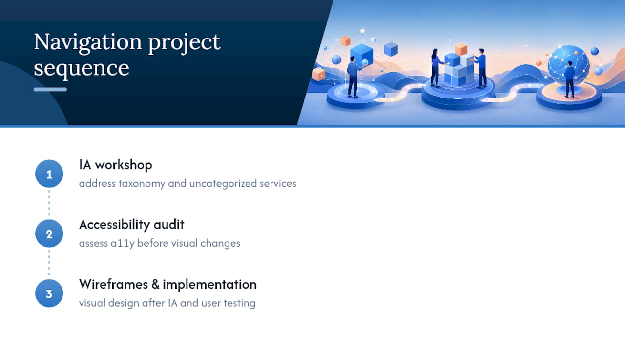
We sequence every navigation project the same way: IA workshop first, accessibility audit second, wireframes and implementation last. Tools that help automate taxonomy and content-tagging work, like AmmarAI’s marketing planning tools, can speed up the labeling and categorization grind, but they don’t replace testing with real users.
The overlooked truth in most navigation debates is that visual polish gets blamed for structural failures. A site with an ugly but well-organized menu will outperform a gorgeous one built on bad IA every time. Our portfolio has more than a few examples where the fix wasn’t a new nav bar, it was rebuilding the categories underneath it.
Get Your Navigation Structure Right the First Time
If you’d rather not run the card sorts, tree tests, and accessibility audits yourself, there are agencies that handle navigation design and audits to ensure functionality and accessibility. Some agencies offer IA workshops, wireframing based on user search behavior, and accessibility audits before launch to avoid retrofitting fixes later.

Our professional web design process starts with your site structure, not your color palette, because a navigation menu built on solid IA converts better and costs less to maintain long term. If you want to see how that plays out on real projects, browse our portfolio or check our website design pricing to get a sense of what an IA-first rebuild involves for a business your size.
Standards and Research Behind This Guide
This guide draws on WCAG 2.1’s location and navigation guidance, Nielsen Norman Group’s menu design research, and Human Standards’ navigation interaction patterns. For a deeper dive into related implementation work, see our internal linking strategy guide and responsive design benefits for Arizona small businesses.
Sources
- WCAG 2.1 guidance (location) — DPI North Carolina
- Menu design checklist — Nielsen Norman Group
- Navigation interaction patterns — Human Standards
- Website navigation menu best practices — DreamHost blog
FAQ
What Makes Website Navigation Design “Good”?
Good navigation instantly answers “Where am I?” and “Where can I go?” using clear labels, a shallow hierarchy of about three levels, and visible primary links rather than hidden menus.
How Many Items Should a Main Navigation Menu Have?
Stick to 4 to 6 primary categories. More than that usually signals an information architecture problem rather than a navigation problem.
Should I Use a Hamburger Menu on Desktop?
No. Hamburger menus are best reserved for mobile overflow items, since research shows hidden navigation reduces discoverability and task success compared to visible menus.
What’s the Difference Between Card Sorting and Tree Testing?
Card sorting lets users group your content into categories that make sense to them, while tree testing gives them a specific task to complete within a proposed structure to see if they can find it.
Does Navigation Design Actually Affect Conversion Rates?
Yes. Confusing navigation increases bounce rate and abandons tasks before conversion, while clear labeling and shallow hierarchies keep users moving toward checkout or contact pages. Agencies like Webtechs treat IA and accessibility audits as a core part of web design projects for exactly this reason.