

8 Website Copywriting Examples You Can Swipe and Test

This article delivers exactly what the title promises: a curated set of website copywriting examples paired with swipeable templates you can adapt and test on your own pages today. Each example includes the exact line to notice, a concise analysis of why it works, and a ready-to-use formula. The approach follows the inverted-pyramid principle Twilio recommends for web copy: lead with the highest-value message, support it with proof, then close with a clear action.
Walk away with:
- 8 real-brand examples to model across hero, product, pricing, and CTA copy
- 3 headline formulas with concrete swipe-lines
- 3 CTA templates you can drop in and test this week
- A 5-step implementation checklist with timeline and metrics
Key Takeaways
The single most effective move in website copywriting is placing your highest-value message first, then supporting it with specific proof and a friction-reduced action.
| Point | Details |
|---|---|
| Lead with the outcome | Hero headlines that name a specific result outperform clever taglines; use benefit-first or specificity formulas first. |
| Microcopy moves metrics | Form button text, error messages, and placeholders sit at high-intent moments — test these before rewriting your hero. |
| Specificity beats vague claims | Numbers, timeframes, and named outcomes (“800,000+ teams”) build credibility faster than superlatives. |
| A/B test one element at a time | Change one copy element per test, define your metric before launch, and run for at least two weeks. |
| Webtechs applies these patterns | Webtechs implements copy audits, A/B test setups, and full-page rewrites for small businesses in Arizona — see the portfolio for applied examples. |
Table of Contents
- 8 website copywriting examples worth studying right now
- Six deep-dive case studies: exact lines, why they work, and a swipe you can use
- Headline formulas, CTA templates, and swipe-lines you can test this week
- Why microcopy deserves more of your attention than it gets
- How to adapt a copy example to your site in 5 steps
- What working with real clients teaches you about copy
- Useful sources and further reading
8 website copywriting examples worth studying right now
These eight examples span hero headlines, product-page value lines, pricing microcopy, and CTAs. Each one earns its spot because it does something specific well — not just “sounds good.”
1. Zapier — “Automate your work. Zapier moves info between your apps automatically, so you can focus on your most important work.”
Why it works: The first sentence is a two-word command that names the outcome. The second sentence explains the mechanism and the payoff in one breath. Zero jargon, zero wasted words.
Swipe label: [Verb] your [task]. [Tool] does [mechanism] so you can [real benefit].
2. Mailchimp — “Turn emails into revenue.”
Why it works: Four words. Subject, verb, object. The word “revenue” does the heavy lifting — it speaks directly to the business owner’s bottom line, not to features or deliverability rates.
Swipe label: Turn [input] into [desired outcome].
3. Grammarly — “Great Writing, Simplified.”
Why it works: The tension between “great” and “simplified” is the whole pitch. It acknowledges the reader’s fear (writing is hard) and dissolves it in two words. Short enough to read on a mobile screen in under a second.
Swipe label: [Aspirational result], [friction removed].
4. ClickUp — “One app to replace them all.”
Why it works: This line works on consolidation anxiety — the pain of juggling too many tools. “Replace them all” is bold and slightly provocative, which earns a second look. It also sets up a clear competitive frame without naming a single competitor.
Swipe label: One [solution] to replace [the problem category].
5. Pexels — “The best free stock photos & videos shared by talented creators.”
Why it works: “Best,” “free,” and “talented creators” each handle a separate objection in one sentence: quality, cost, and source credibility. Packing three trust signals into a single line is efficient homepage copywriting.
Swipe label: The [superlative] [product] [key differentiator] by [credible source].
6. A SaaS pricing page — “Start free. Upgrade when you’re ready.”
Why it works: The second sentence removes the pressure that “Start free” alone creates. Readers often hesitate at free trials because they fear a forced upgrade. That second line answers the objection before it forms.
Swipe label: Start [low-commitment action]. [Upgrade/expand] when [reader-controlled condition].
7. A service homepage — “We build websites that get found on Google.”
Why it works: Specific, outcome-focused, and written in plain English. “Get found on Google” is how a real client describes the goal, not how an agency describes its service. Matching the reader’s own language reduces cognitive friction.
Swipe label: We [verb] [product/service] that [client-language outcome].
8. An e-commerce product page — “Ships in 24 hours. Free returns. No questions asked.”
Why it works: Three short sentences, each handling a separate purchase hesitation: speed, risk, and hassle. The rhythm is punchy because every sentence is roughly the same short length — which works here because the goal is rapid reassurance, not explanation.
Swipe label: [Speed claim]. [Risk removal]. [Friction removed].
Six deep-dive case studies: exact lines, why they work, and a swipe you can use
Case study 1: Hero headline — Zapier
Exact line: “Automate your work.”
Why it works: Hero copy is the hardest short-form copy to get right — most brands bury the value proposition under a clever tagline. Zapier skips cleverness entirely. The imperative verb “Automate” puts the reader in motion immediately. The object “your work” is personal and broad enough to apply to almost any job function. It lives above the fold, in the largest type on the page, and it answers the visitor’s first question (“What does this do?”) in two words.
Before: “The leading workflow automation platform for modern teams.”
After: “Automate your work.”
Swipe/template: [Action verb] your [specific pain point or task]. Keep it under five words. Test it against a longer descriptive version.
A/B test idea: Run the two-word imperative against a benefit-plus-timeframe version (“Save 10 hours a week on manual tasks”) and measure scroll depth and signup rate.
Case study 2: Product feature line — Mailchimp
Exact line: “Turn emails into revenue.”
Why it works: This line uses the BAB formula (Before/After/Bridge) compressed into four words. “Emails” is the before state — a tool you already have. “Revenue” is the after state — what you want. The verb “turn” is the bridge. Pairing a proven formula with a concrete outcome like “revenue” consistently outperforms vague benefit language in copy tests.
Before: “Mailchimp helps you send better emails and grow your audience.”
After: “Turn emails into revenue.”
Swipe/template: Turn [existing asset or behavior] into [desired business outcome].
A/B test idea: Test “Turn emails into revenue” against “Grow your revenue with every email you send” and track click-through rate on the primary CTA below the headline.
Case study 3: Pricing page microcopy — SaaS
Exact line: “Start free. Upgrade when you’re ready.”
Why it works: Pricing pages carry the highest anxiety of any page on a site. Visitors are one objection away from leaving. This two-sentence combination handles the two biggest objections in sequence: cost (free) and commitment (your timeline, not ours). The phrase “when you’re ready” transfers control to the reader, which reduces friction and improves completion rates on signup forms.
Before: “Try our 14-day free trial. No credit card required.”
After: “Start free. Upgrade when you’re ready.”
Swipe/template: Start [low-commitment action]. [Next step] when [reader-controlled condition].
A/B test idea: Test the two-line version against a single line (“Free forever on our Starter plan”) and measure trial signup rate and plan upgrade rate at 30 days.
Case study 4: Signup CTA — Grammarly
Exact line: “It’s free to get started.”
Why it works: This CTA subtext appears directly below the primary button. It answers the one question that stops people from clicking: “What does this cost me?” The phrase “get started” is softer than “sign up” or “create account” — it implies low commitment and forward motion rather than a transactional exchange. Small wording shifts like this one can materially move conversion metrics on signup pages.
Before: “Create your free account.”
After: “It’s free to get started.” (as button subtext)
Swipe/template: It’s [cost or effort signal] to [soft action verb].
A/B test idea: Test “It’s free to get started” versus “No credit card required” as button subtext and measure button click rate.
Case study 5: Form microcopy — search bar placeholder
Exact line: “Search millions of photos” (Pexels search bar)
Why it works: Most search bars say “Search…” and nothing else. Pexels uses the placeholder to remind the user of scale — “millions of photos” — which reinforces value at the exact moment of intent. The reader is about to search, which means they are already engaged. That placeholder does double duty: it guides behavior and restates the value proposition simultaneously.
Before: “Search…”
After: “Search millions of photos”
Swipe/template: [Action verb] [scale or specificity cue] in the placeholder.
A/B test idea: Test a generic “Search…” placeholder against “Search [X] [product/content type]” and measure search initiation rate and session depth.
Case study 6: Trust and social proof snippet — ClickUp
Exact line: “Trusted by 800,000+ teams worldwide.”
Why it works: Social proof works because it offloads the decision to a crowd. The specific number (800,000+) is more credible than “thousands of teams” because it is precise. “Worldwide” broadens the implied peer group. This line typically appears directly below the hero CTA, where hesitation is highest — which is exactly the right placement for a trust signal.
Before: “Join thousands of happy customers.”
After: “Trusted by 800,000+ teams worldwide.”
Swipe/template: Trusted by [specific number]+ [audience descriptor] [scope].
A/B test idea: Test a number-based social proof line against a named-client version (“Used by teams at Google, Airbnb, and Nike”) and measure CTA click rate.
Headline formulas, CTA templates, and swipe-lines you can test this week
Good copy rarely starts from scratch. The patterns below come from proven formulas like AIDA, PAS, and BAB — adapted here into ready-to-use templates.
Headline formula groups
Benefit-first — lead with the outcome, not the feature. Use this when your reader already knows the category and just needs to know why you.
- “[Outcome] without [the thing they hate]”
- “Get [specific result] in [timeframe]”
- “The [adjective] way to [desired outcome]”
Specificity + number — numbers signal credibility and set expectations.
- “[Number] ways to [achieve goal] in [timeframe]”
- “How [Company] [achieved result] with [method]”
- “[Number]-step [process] for [outcome]”
How-to/instructional — works well for educational content and feature pages.
- “How to [achieve goal] without [common obstacle]”
- “How [audience] [achieve outcome] using [tool/method]”
Curiosity gap — use sparingly; works best for email subject lines and blog titles, less so for hero copy.
- “Why [common belief] is costing you [loss]”
- “What most [audience] get wrong about [topic]”
CTA template groups
| CTA Type | Swipe 1 | Swipe 2 | Swipe 3 |
|---|---|---|---|
| Urgent | “Claim your spot” | “Get instant access” | “Start today, free” |
| Low-friction | “See how it works” | “Take a quick look” | “Try it free” |
| Trust-building | “No credit card needed” | “Cancel anytime” | “Join [X]+ users” |
Why microcopy deserves more of your attention than it gets
Most copywriters spend 90% of their time on hero headlines and almost none on the small lines that actually touch the reader at the moment of decision. That is a mistake.
Microcopy covers form labels, button text, placeholder copy, inline help, and error messages. These lines are short, but they appear at high-friction moments: when a reader is about to enter their email, click a button, or recover from a mistake. Microcopy tweaks on form CTAs and error messages can materially reduce friction and improve completion rates — sometimes more than a full headline rewrite.
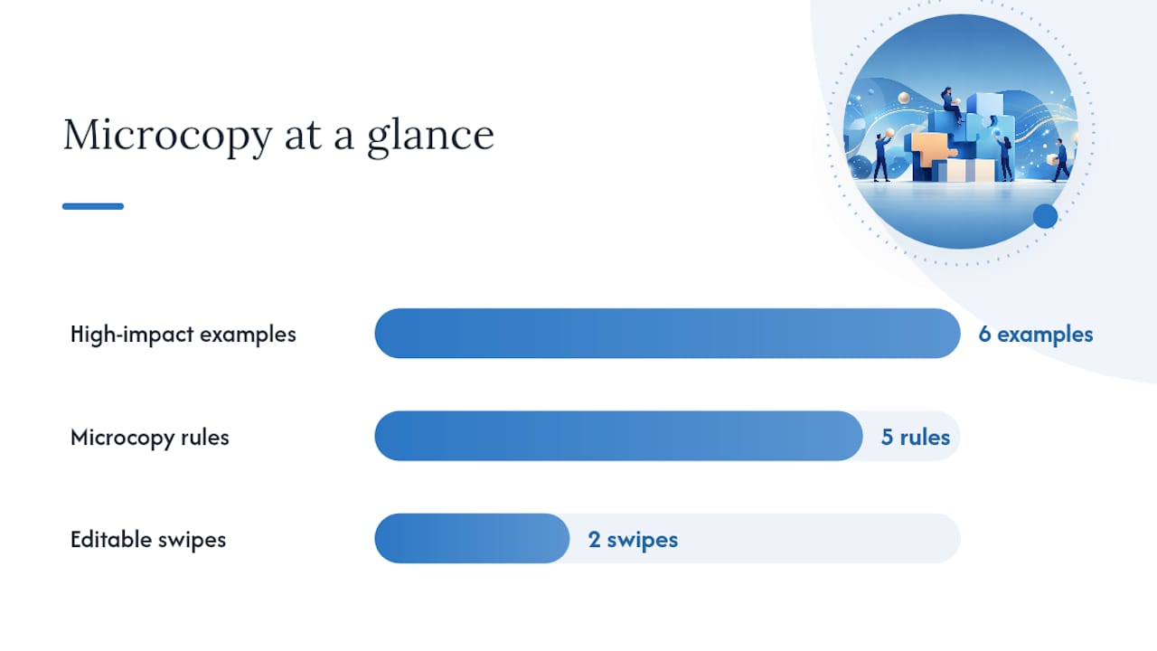
Six high-impact microcopy examples:
- Form label: “Email” → “Work email (we’ll send your results here)” — explains the why, reduces hesitation.
- Button text: “Subscribe” → “Send me the weekly tips” — specific and benefit-led.
- Error message: “Required field” → “We need this to send your quote.” — human and purposeful.
- Inline help: “Password must be 8 characters” → “Use 8+ characters — mix letters and numbers for best security.” — adds context without condescension.
- Confirmation message: “Success!” → “You’re in. Check your inbox in the next 2 minutes.” — sets expectations and reduces anxiety.
- Empty state: “No results found” → “Nothing matched that search. Try a broader term or browse our categories.” — guides the next action instead of leaving the reader stranded.
Five microcopy rules:
- Keep mobile CTAs to 3–5 words maximum.
- Write form labels as benefit statements, not field names.
- Error messages should explain what went wrong AND what to do next.
- Confirmation messages should set a specific expectation (time, next step).
- Placeholder text should reinforce value, not just describe the field.
Pro Tip: Before rewriting your hero, audit your form’s button text and error messages first. These lines sit at the highest-intent moments on your page, and a one-word change can move completion rates faster than a full copy overhaul.
Two editable microcopy swipes:
- Button: “Get my free [result/report/quote]”
- Error: “Hmm, that [field] doesn’t look right. Try [specific fix].”
How to adapt a copy example to your site in 5 steps
Inspiration without implementation is just reading. Here is how to move from “I like that line” to “I tested that line and here is what happened.” Small copy changes measured with headline and CTA A/B tests consistently reveal surprising winners among simple swaps.
- Select the example (30 minutes). Pick one example from this article that matches your page type (hero, product, pricing, form). Write down the specific line you want to adapt and the swipe template you will use.
- Adapt voice and specificity (1–2 hours). Replace the generic terms in the swipe with your brand’s specific language. If the swipe says “[outcome],” write your actual outcome. If it says “[audience],” name your real customer. Use the language your customers use, not the language your industry uses.
- Implement on the page (1–4 hours depending on your CMS). Place the new copy in the correct location: hero copy above the fold, social proof directly below the primary CTA, microcopy inside or adjacent to the form field. Use your CMS or a tool like Google Optimize to set up the variant. For improving website content, placement matters as much as the words themselves.
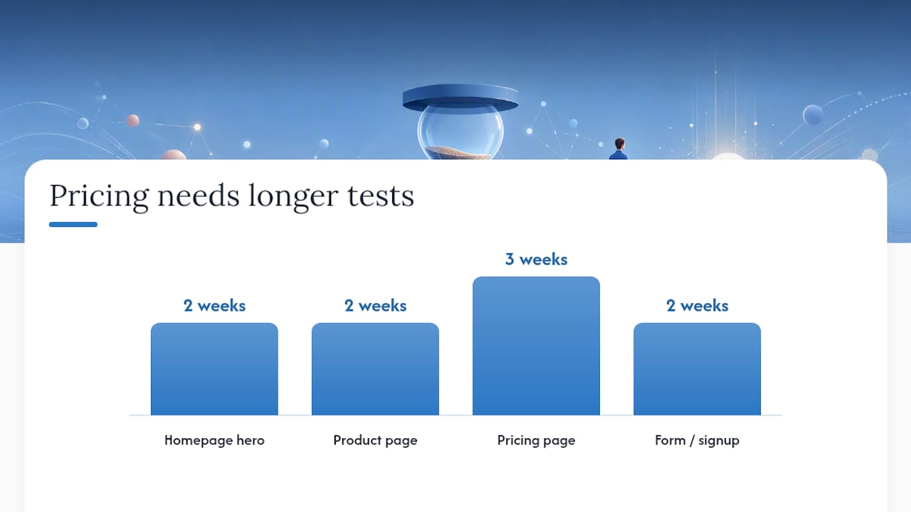
- Design and launch the A/B test (2–4 hours). Set a control (current copy) and a variant (new copy). Define your primary metric before you launch. Run the test until you reach statistical significance or a minimum of two weeks, whichever comes later.
- Read results and iterate (ongoing, 30 minutes per review cycle). Check your primary metric and one secondary metric. If the variant wins, ship it and test the next element. If it loses, analyze why and test a different angle. Track results in a simple campaign planner like LifeDesk’s marketing features to keep your test log organized.
Metrics to watch by page type:
| Page type | Primary metric | Secondary metric | Minimum test duration |
|---|---|---|---|
| Homepage hero | Scroll depth / time on page | CTA click rate | 2 weeks |
| Product page | Add-to-cart rate | Page exit rate | 2 weeks |
| Pricing page | Trial/plan signup rate | Plan upgrade rate (30 days) | 3 weeks |
| Form / signup | Form completion rate | Email open rate (day 1) | 2 weeks |
What working with real clients teaches you about copy
The examples in this article are clean and instructive — which is exactly why they can mislead you in practice. Real client sites rarely look like Zapier or Mailchimp. They have legacy copy written by committee, product names that made sense internally but confuse visitors, and hero sections that try to say six things at once.
The pattern Webtechs sees most often with small businesses in Arizona: the homepage hero describes the company (“We are a family-owned [service] provider serving the Valley since 2003”) instead of the customer’s outcome. That is the first thing to fix. Swap the company-centric opener for a client-language outcome line, and the page immediately becomes more readable.
A second common pattern: the CTA says “Contact Us” when it could say “Get a free estimate in 24 hours.” The first asks the visitor to do something for you. The second tells them what they get. That one swap, applied to a local roofing client’s site, is the kind of change that shows up in SEO case studies as a measurable lift in lead form completions.
The hardest part is not writing the new copy. It is convincing a client that shorter, simpler, and more specific is better than longer and comprehensive. Voice-first positioning and messaging blueprints help because they give clients a framework to evaluate copy against their audience’s language, not their own preferences.
Useful sources and further reading
The sources below informed this article and are worth bookmarking for deeper study.
- 23 Rules for Writing Website Copy in 2025 | Twilio
- 8 Website copywriting tips to polish your site | Shopify
- Website Copywriting: 11 Expert Tips to Increase Conversions | HubSpot
- Website copywriting tips and guidelines | WordStream
- 10 World-Class Copywriting Examples + Formulas for 2026 | Drip
- The Best Website Copy Examples: Hero Version | Edify Content
- Caitie Cupples Creative | Copywriter for Small Businesses
- Copywriting Services for Small Businesses | Branded With a Purpose
Internal resources from Webtechs:
- Copywriting vs. content writing: what’s the difference? — Useful if you are mapping these examples to a specific service type.
- Improve website conversions for small businesses — Practical conversion guidance that pairs directly with the copy examples above.