
60:30:10 Website Color Psychology That Works for Arizona SMBs
Color forms a snap judgment before a single word gets read, and that judgment either builds trust or kills it. The fix is not complicated: apply a 60-30-10 palette split (dominant, secondary, accent), confirm every accent meets WCAG contrast minimums, and build it as reusable code tokens instead of one-off hex values. Pick your primary, accent, and neutral colors, run a contrast check, ensuring compliance with accessibility standards, then implement.
TL;DR:
- A consistent 60-30-10 color palette ratio and WCAG contrast compliance are essential for creating accessible, trustworthy website designs tailored for Arizona audiences.
- Different industries benefit from specific color associations, with trust-oriented sectors favoring blue and energetic CTAs using orange or yellow, while healthcare often employs calming green tones.
- Testing palettes with real users outdoors and applying contrast checkers is crucial to ensure visual clarity under harsh sunlight and for users with color vision deficiencies.
- Dark mode palettes require a separate, purpose-built design to avoid harsh contrast and unintended vibrancy, rather than simple inversion of light palettes.
- Locally relevant warm desert tones like terracotta and sage green deepen regional resonance, especially for small businesses, by reflecting Arizona’s landscape and environment.
Table of Contents
- How Website Color Psychology Shapes First Impressions
- What Do Different Colors Mean on a Website?
- How Do You Build a Practical Website Color Palette?
- What Contrast Ratio Does WCAG Require for Websites?
- Why Does Dark Mode Need Its Own Color Palette?
- Testing and Launch Checklist for Arizona Small Businesses
- Do Arizona Audiences Respond to Color Differently?
- How Do Color Combinations Affect the Way a Website Feels?
- What Do Effective Website Color Schemes Look Like in Practice?
- How Do You User Test a Color Palette Beyond Automated Tools?
- How Do You Build a Color Mood Board for a Website?
- How Should Brand Personality Shape Your Color Choices?
- How Webtechs Approaches Color Strategy for Scottsdale Businesses
- Get a Color Palette Review From a Scottsdale Design Team
- Sources
- FAQ
How Website Color Psychology Shapes First Impressions
Visitors size up a site fast, and color does most of the talking before they read a headline. Research on website color psychology puts first-impression formation at 50 to 300 milliseconds, and color carries most of that judgment. That is faster than a person can read your tagline, let alone your value proposition.
This creates a real problem when the palette contradicts the business. A tax preparer running a neon, candy-colored homepage reads as unserious, no matter how solid the accounting behind it. A pediatric dentist using stark corporate navy and gray can feel cold to parents looking for warmth. Color acts as a kind of silent language, signaling authority or playfulness before anyone reads the copy, and when that signal clashes with what the business actually does, visitors feel a flicker of doubt they usually cannot name. They just leave.
Common misalignments worth checking on your own site:
- Playful, saturated palettes on law firms, financial services, or medical practices where credibility matters more than energy
- Overused high-contrast accents that turn every button into a shout, so nothing stands out because everything does
- Palettes copied from a trendy template that has nothing to do with the industry or the local audience
Get the palette right, and it does work your copy cannot do alone.
What Do Different Colors Mean on a Website?
Every major color family carries a common emotional association, and shade choice changes that meaning more than most people expect. CreativeBloq’s breakdown of color and emotion is a useful starting reference, but the practical application matters more than the theory.
Here is a working cheat sheet that can be used when scoping a new site:
- Blue signals trust, stability, and calm. It is the safest default for finance, healthcare, home services, and B2B, and it is why so many banks and insurers lean on it.
- Green reads as growth, health, and approval. Strong for landscaping, wellness, sustainability, and any “go” action like a confirmation state.
- Red grabs attention and signals urgency. Effective in small doses for sales, limited offers, or warnings; overwhelming as a dominant brand color because it raises visitor stress.
- Orange and yellow feel energetic and optimistic, good for CTAs and youthful brands, but they fatigue the eye fast at high saturation and read as cheap if overused.
- Purple carries luxury and creativity. Common in beauty, high-end retail, and anything positioning itself as premium.
- Neutrals (gray, beige, tan) let content and photography breathe. They are not boring, they are structural.
Two shade rules matter more than the color itself. Keep saturation around 60 to 80 percent for most UI elements. Colors sitting at full saturation look harsh on screen and fight for attention against everything else. And skip pure black (#000000) for body text. Near-black values like #1A1A1A reduce eye strain and sit better against photography and white space, a detail most template builders never bother to fix.
How Do You Build a Practical Website Color Palette?
Most professional interfaces follow a 60-30-10 ratio: 60 percent dominant canvas (background and large surfaces), 30 percent secondary color (panels, section dividers, navigation), and 10 percent accent reserved for calls to action and key highlights. A home services site might run a soft off-white background (60), a deep blue for the header and footer (30), and a warm orange reserved only for the “Get a Quote” button (10). That accent works precisely because it appears almost nowhere else on the page.
Palette size matters just as much as ratio. Limiting a palette to a moderate number of colors keeps a site coherent; using too many colors can confuse visitors and weaken visual hierarchy. A workable structure looks like this:
- Primary brand color — used for the logo, header, and primary navigation
- Secondary color — panels, cards, section backgrounds
- Accent color — CTAs, links, and anything that needs to demand a click
- Neutral light — page backgrounds, whitespace
- Neutral dark — body text, borders
- Success/error semantic colors — form validation, confirmation states
Assign each role a named CSS variable, something like --color-button-primary-bg or --color-text-body, rather than hard-coding hex values into every component. Hard-coded hex creates technical debt: fixing one contrast failure or rebranding later means hunting through every file instead of changing one token.
Pro Tip: Test every accent color at the actual size it will appear on the page. A shade that looks bold in a 300 pixel mockup can wash out or vibrate uncomfortably at button size, especially on a phone screen in direct sunlight.
What Contrast Ratio Does WCAG Require for Websites?
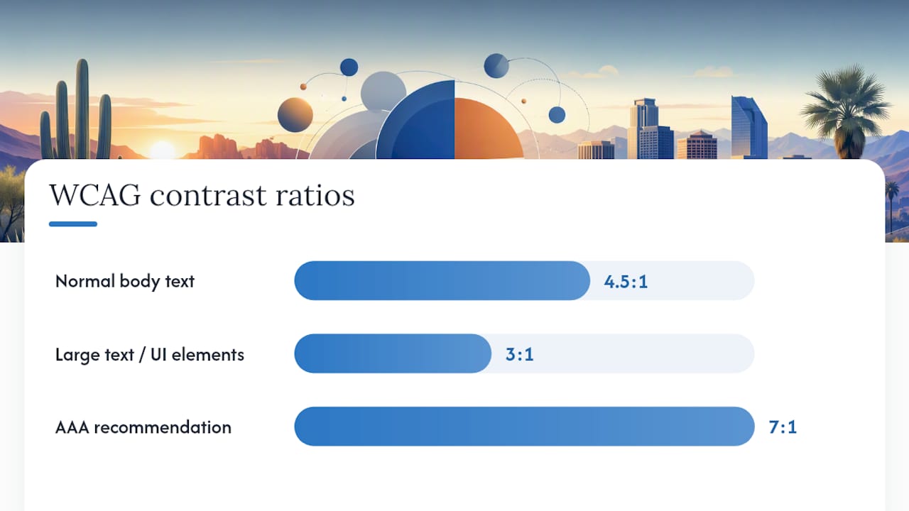
WCAG 2.2 sets the bar plainly: normal body text needs a contrast ratio of at least 4.5:1 against its background, and large text or UI elements need at least 3:1. The AAA standard, recommended for sites serving older audiences, pushes that to 7:1.
This is not a bureaucratic nicety. Roughly 8% of men and 0.5% of women have some form of color vision deficiency, which means a meaningful share of every Arizona site’s visitors physically cannot rely on color alone to read a page correctly. A red “error” label that only differs from the background in hue, with no contrast difference and no icon, is invisible to a chunk of your audience.
MDN’s guidance on color usage is direct about this: never use color as the only signal. Pair every color-coded state with text, an icon, or a pattern. A form error should show red text plus a warning icon plus a written message, not a red border alone.
Scottsdale’s sunlight makes this worse before it makes it better. Screens viewed outdoors or through car windshields lose apparent contrast fast, so a palette that barely clears 4.5:1 in a dim office can become unreadable on a job site or a patio table. Push contrast higher than the legal floor wherever the design allows it.
Practical validation before launch:
- Run every text and background pairing through a contrast checker, not just the hero section
- Use a color-blindness simulator on the full page, not isolated components
- Check the site on an actual phone outdoors, at midday, not just in a dim office
Why Does Dark Mode Need Its Own Color Palette?
Flipping a light palette’s values to build dark mode is the most common shortcut, and it almost always backfires. Simply inverting values breaks the visual hierarchy the light palette was built around, and it frequently turns saturated accent colors into something that seems to vibrate against a near-black background, an effect caused by high contrast between fully saturated hues and very dark surfaces.
A dark palette needs its own design pass, not an inversion:
- Use a tinted near-black (something like a very dark blue-gray) for backgrounds instead of pure black, which creates harsh contrast and can make photography look washed out
- Desaturate accent colors slightly for dark surfaces; the same orange CTA that pops on white can glare uncomfortably on black
- Maintain a completely separate set of CSS variables for dark-mode surfaces, text, and accents rather than calculating them on the fly
Treat dark mode as a second, purpose-built palette that happens to share your brand’s hue family, not a filter applied to the light version.
Testing and Launch Checklist for Arizona Small Businesses
Before any site goes live, run the palette through a short, non-negotiable checklist rather than trusting it by eye.
- Check contrast on every pairing, not just body text. Buttons, form labels, footer links, and placeholder text all need to clear the WCAG floor, and pushing above it is worth the extra effort where the design allows.
- Simulate common color vision deficiencies across the full page, then, where you can, put the design in front of a handful of real users and watch where their eyes go.
- A/B test your CTA accent against your core brand color. The two rarely perform identically, and the winner is not always the one that looks best in a design meeting.
- Ship every color as a token, so a contrast fix or seasonal promotion is a one-line change instead of a re-deployment across templates.
Pro Tip: Check your site on a phone outdoors at midday before calling any color decision final. Arizona glare exposes weak contrast that looks fine on a calibrated monitor indoors.
Do Arizona Audiences Respond to Color Differently?
Local context shapes color perception more than most palette guides admit. Scottsdale and the wider Phoenix metro sit in a landscape dominated by warm desert tones, saturated blue sky, and intense sun, and that visual environment sets a baseline expectation for what looks “natural” here versus what looks imported from somewhere else.
Terracotta, sand, sage green, and turquoise carry regional resonance for Arizona audiences in a way that a generic corporate blue-and-gray palette does not. That does not mean every Scottsdale business needs a Southwestern theme. A law firm or medical practice can and should still lean on blue for trust. But a home services company, a restaurant, or a boutique retailer often benefits from working warm desert neutrals into the secondary or accent layer, because it signals “we’re from here” without saying a word.

Sun exposure is a practical factor too. Screens get checked outdoors constantly across the Valley, whether on a patio, at a trailhead, or in a parking lot before an appointment. A palette that reads as elegant and subtle indoors can wash out entirely under direct sun, which is one more reason contrast should sit above the legal minimum rather than skating right at it. Vacation and seasonal-resident traffic matters too: a meaningful share of visitors to Arizona service sites are newcomers or part-time residents comparing local businesses for the first time, so the palette needs to read clearly to people with zero prior familiarity with the brand.
How Do Color Combinations Affect the Way a Website Feels?
Individual colors carry meaning, but combinations create the feeling that actually sticks with a visitor. Two colors sitting close together on the color wheel (analogous pairs, like blue and teal) create a calm, cohesive mood. Colors sitting opposite each other (complementary pairs, like blue and orange) create energy and visual tension, which is exactly why so many CTA buttons use the complementary color to the brand’s dominant hue.
Harmony does not mean “matching.” It means the relationships between hues, values, and saturation levels feel intentional rather than accidental. A site using three colors of roughly equal saturation and brightness tends to feel flat and hard to scan, because nothing in the layout tells the eye where to look first. A site using one dominant muted tone, one supporting tone, and one sharp, saturated accent creates a visual path: background, content, action.
Temperature contrast matters as much as hue contrast. Pairing a cool dominant color (blue, teal, gray) with a warm accent (orange, coral, gold) tends to read as more dynamic than pairing two cool tones or two warm tones together, because the eye naturally seeks out the temperature shift. That is part of why “blue background, orange button” shows up so often across unrelated industries; it is not a coincidence, it is a reliable visual mechanism.
The failure mode to watch for is competing accents. A page with a red “Sale” badge, a green “In Stock” tag, and a blue CTA button all fighting on the same screen forces the visitor’s eye in three directions at once. Pick one accent color to mean “click here” and reserve every other bright color for a different, less action-oriented purpose.
What Do Effective Website Color Schemes Look Like in Practice?
The clearest way to see color psychology working is to look at how established categories default to certain palettes, and why deviation from that default carries risk.
Financial and insurance sites lean overwhelmingly blue, sometimes paired with a single warm accent for the “Get a Quote” button. That is not a lack of creativity; it is a deliberate bet that trust outweighs novelty when someone is about to hand over financial information. A financial services site that swapped its blue for a bright, playful palette would likely see hesitation increase, even if the underlying service quality never changed.
Home services and contracting sites (roofing, HVAC, landscaping) tend to combine a deep, stable secondary color with a high-visibility accent, often orange or yellow, because these sites live or die on one action: get the phone to ring or the form to submit. Every design decision subordinates itself to that single accent color standing out against a calmer background.
Wellness and healthcare-adjacent sites (spas, dental, physical therapy) frequently pull green or soft teal into the palette specifically because it reads as calming rather than clinical, a deliberate move away from the sterile white-and-navy combination that dominated healthcare web design a decade ago.
Restaurants and hospitality sites are the outlier: they often use warmer, more saturated palettes, because the goal is appetite and atmosphere, not the caution a financial site needs. The lesson across all four categories is the same. The winning palette matches the emotional job the visitor needs the site to do, not the designer’s personal taste.
How Do You User Test a Color Palette Beyond Automated Tools?
Contrast checkers and simulators catch technical failures, but they cannot tell you whether a palette feels right to an actual customer. That requires putting real people in front of the design.
A short five-minute feedback session with five to eight people who match your actual customer base reveals more than a week of internal debate. Show them the homepage for five seconds, then take it away and ask what they remember and how the business made them feel. If a landscaping company’s palette makes people say “expensive” or “cold” when the business is actually affordable and approachable, that is a five-second test catching a real mismatch before launch.
Eye-tracking and click-tracking tools show where attention actually lands once the palette goes live, and they often surface a hard truth: the accent color you were sure would draw the eye gets ignored, while something you treated as background detail is pulling clicks it should not.
Simple preference testing works too. Show two or three palette variants side by side and ask which one “feels like it belongs to this business.” People struggle to articulate why a palette works, but they are remarkably consistent at picking the one that does, and that gut reaction from real prospective customers outweighs any internal opinion about which shade of blue looks more sophisticated. Combine this kind of feedback with the technical checks from the earlier testing section, rather than treating either one as sufficient alone.
How Do You Build a Color Mood Board for a Website?
A mood board turns vague preference into a defensible palette decision, and building one does not require design software beyond a free tool like a Pinterest board or a simple slide deck.
Start by gathering 15 to 20 images that represent the feeling the business wants to project, not literal design examples. A veterinary clinic might pull images of warm sunlight, soft textures, and calm greens rather than screenshots of other vet websites. Pulling from outside the industry keeps the board from turning into a copy of a competitor’s site.
Next, pull the five or six colors that repeat across those images and arrange them by how often they appear. The colors showing up most consistently across unrelated images are usually the ones that genuinely reflect the mood, rather than one striking outlier photo skewing the whole board.
From there, test the emerging palette against real page mockups, not just as swatches sitting next to each other. A color combination that looks appealing as a flat palette can feel completely different once it covers a full page of text, images, and whitespace. Iterate at least once: pull the palette, build a rough homepage layout, look at it critically, then adjust before locking anything in. Most businesses that skip this step end up rebuilding their color system within the first year because the palette never got tested past the swatch stage.
How Should Brand Personality Shape Your Color Choices?
Industry convention gives a useful starting point, but personality is what separates a business from every competitor using the same default blue. The question worth answering before picking any hex code is simple: if this brand were a person at a networking event, how would they act? Confident and understated? Warm and talkative? Precise and no-nonsense?
A boutique law firm that wants to feel approachable rather than intimidating might pull its blue toward a softer, slightly desaturated version rather than the stark navy every competitor uses, signaling trust without the coldness. A contractor who wants to feel established and premium rather than budget might skip the expected orange-and-white combination entirely and lean into deep charcoal with a single gold accent instead, borrowing the premium cue purple and gold typically carry.
Industry type sets the boundaries; personality decides where inside those boundaries the palette actually lands. Two competing HVAC companies can both use blue and orange and still look completely different, because one leans playful and energetic with brighter, more saturated tones, while the other leans steady and professional with muted, deeper versions of the same hues. Neither is wrong. The mistake is picking a palette that matches the industry template but contradicts how the business actually wants to be perceived by the people walking through its door.
How Webtechs Approaches Color Strategy for Scottsdale Businesses
Since 1997, Webtechs has built sites for Scottsdale businesses that need palettes to hold up under Arizona sun, load fast on a job-site phone, and still clear accessibility thresholds. That means checking contrast against real outdoor glare, not just a studio monitor, and building color as reusable tokens so a rebrand or a contrast fix does not mean rebuilding the whole site.
— Brett
Get a Color Palette Review From a Scottsdale Design Team
Webtechs is the alternative to guessing at hex codes alone: a Scottsdale team that builds your palette as tested, accessible code from day one instead of leaving you to fix contrast failures after launch. Every custom website design project starts with a palette built around your brand and your industry, checked against WCAG contrast minimums, and delivered as maintainable code rather than a static mockup that breaks the moment you need to update it.
If you want to see how this plays out on real sites for real Arizona businesses, the Webtechs portfolio shows finished palettes across home services, healthcare, and retail clients across the Valley. Request a quick palette review, and a designer will walk through your current site’s contrast, color meaning, and accent strategy against what your industry and your customers actually expect. Reach out through Webtechs to get that review scheduled.
Sources
- How to Choose a Website Color Palette: 5-Step Process (2026)
- 12 colours and emotions they evoke — CreativeBloq
FAQ
What Contrast Ratio Do I Need for Website Text?
WCAG 2.2 requires at least 4.5:1 for normal text and 3:1 for large text or UI elements, with 7:1 recommended for sites serving older audiences.
How Many Colors Should a Website Palette Have?
Most effective websites use 5 to 7 colors total, covering a primary, secondary, accent, two neutrals, and semantic colors for success and error states.
Why Shouldn’t I Just Invert My Light Palette for Dark Mode?
Inverting values breaks the visual hierarchy the light palette was built around and can make saturated accents appear to vibrate against dark backgrounds, so dark mode needs its own tested palette.
Does Webtechs Build Websites With Accessible Color Palettes?
Yes. Webtechs builds custom websites for Scottsdale and Arizona small businesses with tested, WCAG-checked color systems built as maintainable code; current pricing is available on the Webtechs website.