

Mobile-First Design for Scottsdale: 5 Fixes for More Calls
Adopt mobile-first design now: prioritize content, touch targets, and page speed, and you will see measurable gains in mobile engagement and conversions. This means faster-loading pages, clearer calls to action on phones, and more calls, bookings, and form submissions from local customers. Below is a practical checklist you can run yourself, plus where local help makes the work faster.
TL;DR:
- Google ranks from the mobile version, so keep its content, metadata, and structured data consistent with desktop pages or rankings can suffer.
- Keep key pages within three taps of the homepage, and remove content that does not support calls, bookings, or quote requests.
- Make buttons and links at least 44 by 44 CSS pixels, with enough spacing to prevent mistaken taps for people browsing with one hand.
- Compress and resize images for mobile, then defer noncritical scripts to reduce loading time on phones.
- Audit ad and social landing pages first; test forms and call links on a real phone, since these pages receive paid and organic traffic.
Table of Contents
- What mobile-first design means for Scottsdale small businesses
- A practical mobile-first checklist for your Scottsdale website
- Touch targets and accessibility rules your site needs
- How to audit your site quickly and what to track
- Connecting mobile-first design to social and PPC campaigns
- What successful mobile-first redesigns look like for small businesses
- Where mobile-first design is heading next
- Local perspective: common Scottsdale site issues we see
- Get a mobile-first audit from a Scottsdale web team
- FAQ
- Sources
What mobile-first design means for Scottsdale small businesses
Mobile-first design means building the smallest-screen experience first, then adding features and layout complexity for tablets and desktops. It differs from responsive-first design, which often starts with a desktop layout and shrinks it down, sometimes carrying over clutter that never belonged on a phone. Designer Luke Wroblewski described mobile as a “focusing constraint,” a limitation that forces a business to decide what content and actions actually matter before adding anything else.
This approach matters now because most local searches for Scottsdale services happen on a phone, and Google has made its intent official.
- Mobile-first indexing is now Google’s standard method, meaning the mobile version of your site is what gets crawled and ranked.
- Content, metadata, and structured data must match between mobile and desktop versions or rankings can suffer.
- The Interaction Design Foundation notes that mobile-first design emphasizes visual hierarchy, scanning, and tap targets built for smaller screens from the start.
For a deeper look at how this connects to local conversion rates, our breakdown of responsive web design benefits for Arizona small businesses covers the business side in more detail.
A practical mobile-first checklist for your Scottsdale website
Work through these steps in order. Each one builds on the last, and most take a few hours rather than a full rebuild.
- Audit your homepage and top service pages, and cut any paragraph, slider, or widget that does not support a phone call, booking, or quote request.
- Simplify navigation so a visitor reaches any key page in three taps or fewer, a rule of thumb known as the Three Click Rule.
- Shorten forms to the fields you truly need, and use mobile-friendly input types like tel and email keyboards.
- Compress and resize images for mobile, serving WebP formats with srcset so phones only download what they need.
- Defer non-critical JavaScript and enable compression and a content delivery network on your hosting to cut load time.
A few additional habits keep this work from sliding backward:
- Keep your primary call-to-action button visible without scrolling on every service page.
- Test every form and click-to-call link on an actual phone, not just a browser’s mobile preview.
- Re-check page weight after adding any new image, plugin, or embedded video.
For conversion-specific tactics, our guide on responsive web design that converts walks through call-to-action placement in more depth, and the landing page structure guide offers a useful outside perspective on layout priority.
Touch targets and accessibility rules your site needs
Small tap targets are one of the most common mobile usability failures on local business sites. The W3C’s guidance on Target Size (Enhanced) recommends designing for coarse input, meaning fingers and thumbs rather than a precise mouse pointer, and lists groups who benefit most: people with mobility impairments, anyone browsing one-handed, and users on the move, such as someone tapping a menu while walking into a parking lot.
The practical target for any clickable button, link, or icon is a size that comfortably accommodates finger taps, ensuring enough spacing around elements to prevent accidental activation of neighbors. This also reduces layout shift, since properly sized elements do not need to resize awkwardly as a page finishes loading.
WCAG 2.2 formalized this guidance as part of a broader update aimed at low-vision, cognitive, and mobile users. For a Scottsdale service business, this translates into a few concrete choices: make your phone number tappable and sized like a real button, not a small text link; give your “Request a Quote” button breathing room from other page elements; and avoid stacking multiple small links close together in a footer or menu.
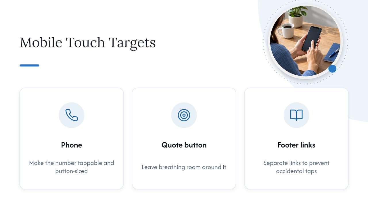
The Interaction Design Foundation refers to this as designing “fat-finger-friendly” interactions, and it is one of the simplest fixes with an outsized effect on mobile conversions.
How to audit your site quickly and what to track
A useful mobile audit does not require special tools beyond your phone and a browser. Start by loading your homepage and three service pages on a mobile connection, not Wi-Fi, and time how long it takes before you can actually tap something.
Watch these metrics as you go:
- Largest Contentful Paint (LCP): how long the biggest visible element, usually a hero image or headline, takes to render; Web treats LCP improvements like hero image optimization and preloading as the highest-ROI fixes for perceived speed.
- Tap accuracy: try tapping every button and link with your thumb; anything you miss on the first try is too small or too close to another element.
- Form completion: fill out your contact or booking form on your phone and note any field that is hard to select or triggers the wrong keyboard.
- Navigation depth: count the taps needed to reach your pricing or service pages from the homepage.
Re-run this check after any site update, not just once a year. For a more conversion-focused version of this audit, the tactics in our responsive design that converts guide pair well with the speed checks above.
Connecting mobile-first design to social and PPC campaigns
A mobile-first site changes how your other marketing channels perform, not just how your homepage looks. Paid search traffic from Google Ads lands on your site at the moment of highest intent, and if that landing page is slow or hard to tap on a phone, the click you paid for gets wasted. Matching your landing pages to the same mobile-first principles, clear single action, fast load, large tap targets, protects the return on every PPC dollar; our PPC landing pages playbook covers this pairing directly.
Social media traffic behaves the same way. Instagram and Facebook link clicks almost always open inside an in-app browser on a phone, so a service page built around a desktop layout will frustrate that visitor before they ever see your offer. A mobile-first service page with a visible phone number and a short form keeps that social traffic from bouncing.
The practical move is to treat your top landing pages, the ones linked from ads and social posts, as the first pages you mobile-first audit, since they carry the most paid and organic traffic per visit. If you run or plan to run Google Ads alongside your site work, our guide on budgeting and strategy for small business Google Ads outlines how the two efforts reinforce each other.
What successful mobile-first redesigns look like for small businesses
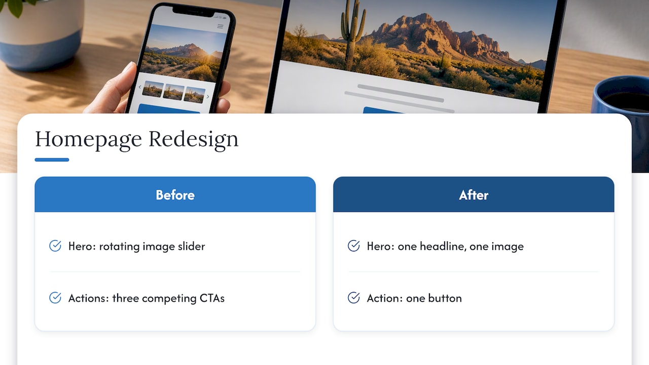
Small and mid-sized businesses that see real gains from mobile-first redesigns tend to share a pattern: they cut the homepage down to one clear action, simplify the main menu, and make the phone number or booking button impossible to miss on the first screen. A local service business that used to lead with a rotating image slider and three competing calls to action often performs better after collapsing that into one headline, one image, and one button.
The common thread across these redesigns is editorial discipline rather than visual polish. The real challenge is cognitive load, not pixels: deciding what a visitor on a four-inch screen actually needs to see to call, book, or request a quote, then removing everything that competes with that single action. Mapping the one core action for each page first, then hiding or cutting whatever does not support it, consistently outperforms adding more features.
For businesses with e-commerce components, this same discipline applies to product pages and checkout flows, where every extra form field or unclear button costs sales on mobile. Our e-commerce and mobile website design services page outlines how this applies to businesses selling online.
Where mobile-first design is heading next
Mobile-first design is moving toward richer, app-like experiences delivered through the browser rather than a separate native app. Progressive Web App patterns, covered in web.dev’s foundations guide, let a mobile site load fast, work offline for key content, and feel closer to a native app without the cost of building one.
Layout techniques are also shifting from fixed breakpoints toward intrinsic, component-level responsiveness. Newer CSS tools like container queries, discussed in web.dev’s guide to new responsive patterns, let individual page sections adapt based on their own container size rather than the whole screen, which keeps design decisions closer to the content itself. Responsive layouts that reflow cleanly also support accessibility goals like readable text at 200% zoom, a point covered in web.dev’s accessible responsive design guide.
For a Scottsdale small business, staying ahead does not mean chasing every new technique. It means keeping the core mobile-first habits, content priority, touch-friendly design, and fast load times, solid enough that newer layout tools are easy to adopt later without a full rebuild.
Local perspective: common Scottsdale site issues we see
The most frequent problems on local Scottsdale sites are heavy hero image sections that slow the first screen, budget hosting that cannot keep up with mobile traffic, and homepages with three or four competing calls to action instead of one clear path to a call or booking.
The highest-return fixes are usually the simplest: trim the hero section, move to hosting built for speed, and make the phone number the most visible element on the page. We have seen site architecture cleanup alone produce a 353% lift in key performance metrics for an Arizona small business, which reflects how much untapped value sits in basic structural fixes before any redesign.
— Brett
Get a mobile-first audit from a Scottsdale web team
We build and host websites, which means mobile-first fixes rarely stop at design. 
We handle the layout changes, the image and code optimization, and the hosting setup that keeps pages fast after launch, along with the local SEO work that keeps mobile-first sites visible in Scottsdale search results through our local SEO services. Our team has worked with Scottsdale businesses since 1997, and that history means we have already seen the hosting shortcuts and navigation habits that quietly cost local businesses calls and bookings.
If your site needs a mobile-first rebuild rather than a tune-up, our website design services cover custom and e-commerce builds designed around the checklist above, and our pricing page gives you a starting point before you request a quote. Reach out through Webtechs to request a mobile-first audit of your current site.
FAQ
What is mobile-first design, in simple terms?
Mobile-first design means building a website’s layout, content, and navigation for the smallest screen first, then adding features for tablets and desktops. It differs from responsive design that starts on desktop and shrinks down, because mobile-first forces every page to prioritize its single most important action from the start, a concept Luke Wroblewski described as using mobile as a focusing constraint.
How is mobile-first different from responsive design?
Responsive design is the technical method, using flexible layouts that adapt to any screen size, while mobile-first is the design philosophy that decides what content and actions appear on that layout first. A site can be responsive without being mobile-first if its content and navigation were originally planned for desktop and simply resized down.
Why does mobile-first design affect my Google rankings?
Google now uses mobile-first indexing as its standard crawling method, meaning the mobile version of your site is what Google evaluates for ranking. If your mobile pages are missing content, links, or structured data that exist on desktop, your rankings can suffer even if your desktop site looks complete.
How big should buttons and links be on a mobile site?
Buttons and tappable links should be at least 44 by 44 CSS pixels with enough surrounding space that a thumb does not accidentally hit a neighboring element, following W3C guidance on target size. This sizing particularly helps users with mobility impairments and anyone browsing one-handed.
How much does a mobile-first website redesign cost?
Pricing depends on the scope of the redesign, from updating an existing site’s layout to a full custom rebuild, and we do not publish a single flat rate for this work. You can review our website design pricing page or request a quote directly for your specific site.
Sources
- Mobile-first indexing has landed – thanks for all your support | Google Search Central Blog | Google for Developers
- Understanding Success Criterion 2.5.5: Target Size (Enhanced) | WAI | W3C
- Web
- Interaction Design Foundation — Mobile First topic